pacman::p_load(tidyverse, reshape2,
               ggthemr, ggtext,
               ggridges, ggpubr,
plotly, ggstatsplot)Take-home Exercise 3
Be Weatherwise or Otherwise
1 Introduction
1.1 Background
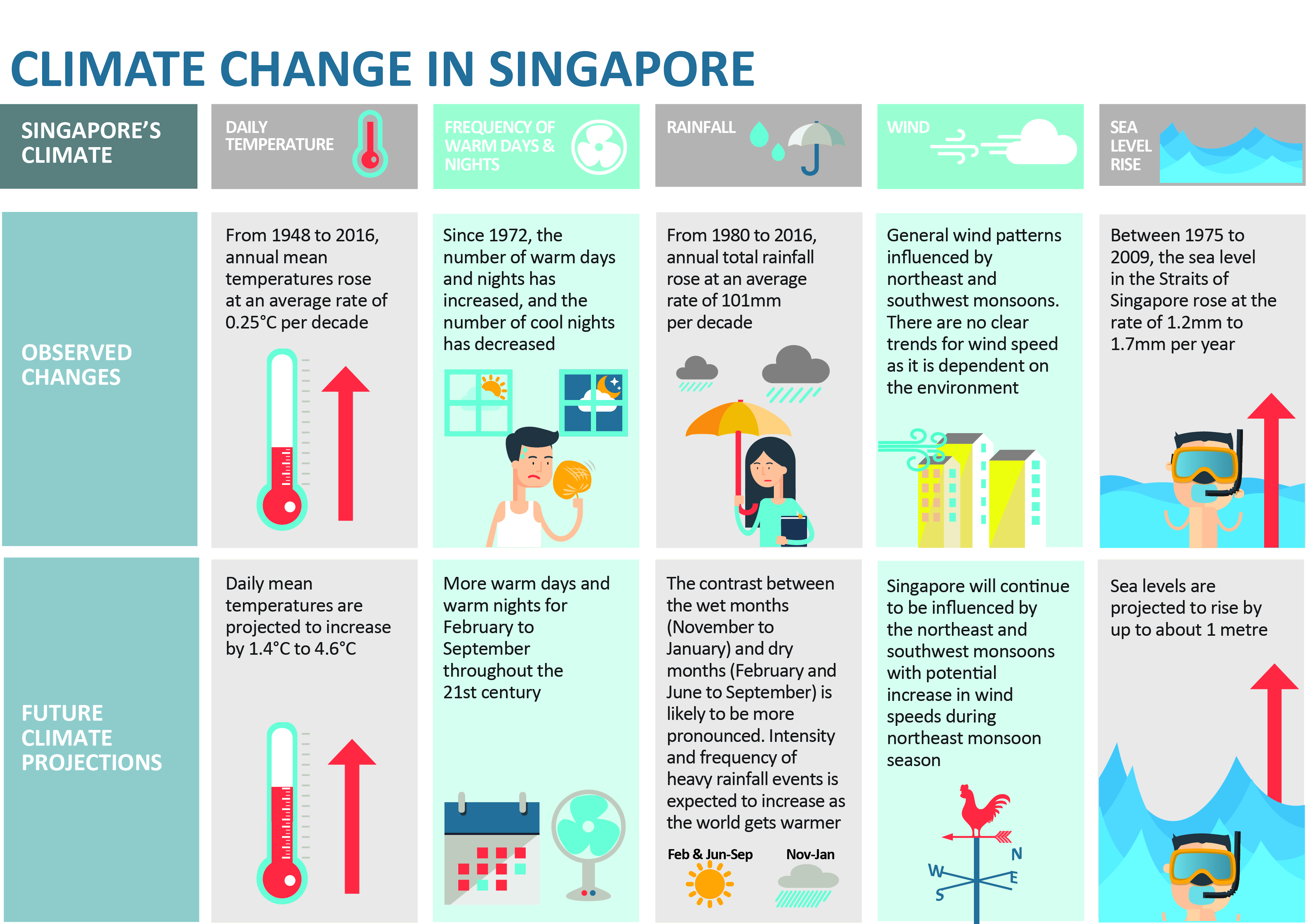
Climate change is the defining global issue of our time – the world faces an increasingly urgent need to mitigate its underlying causes and adapt to its far-reaching impacts. In this regard, Singapore aims to achieve net zero emissions by 2050.
At the same time, Singapore is not spared from the impact of climate change. According to the National Climate Change Secretariat (NCCS), the annual mean temperature increased by 1.1°C from 26.9°C to 28.0°C between 1980 and 2020, and annual total rainfall increased at an average rate of 6.7mm per year between 1980 and 2019. In the future, NCCS expects climate change to “lead to a temperature increase of 1.4°C to 4.6°C and a rise in sea level by up to about 1m by the end of the century”. Also, the “contrast between the wet months (November to January) and dry months (February and June to September) is likely to be more pronounced” and the “intensity and frequency of heavy rainfall events is expected to increase as the world gets warmer”.
1.2 Objective and the Analytical Questions
In this take-home exercise, the objective is to use the appropriate interactive visualisation techniques to enhance user experience in the discovery of Singapore’s weather data.
The key analytical questions are:
How have the mean, maximum, and minimum temperatures changed over the years?
How have the daily rainfall and total rainfall changed over the years?
2 Getting Started
2.1 Setting the Analytical Tools
The R packages used in this take-home exercise are:
tidyverse (i.e. readr, tidyr, dplyr, ggplot2) for performing data science tasks such as importing, tidying, and wrangling data, as well as creating graphics based on The Grammar of Graphics;
reshape2 for transforming data between wide and long formats;
ggthemr for aesthetic themes created by user, Ciarán Tobin;
ggtext for improved text rendering support for ggplot2;
ggridges for creating ridgeline plots;
ggpubr for creating publication ready ggplot2 plots;
plotly for plotting interactive statistical graphs; and
ggstatsplot for creating visual graphics with rich statistical information.
The code chunk below uses the p_load() function in the pacman package to check if the packages are installed in the computer. If yes, they are then loaded into the R environment. If no, they are installed, and then loaded into the R environment.
The ggthemr() function in the ggthemr package is used to set the default theme of this take-home exercise as “solarized”.
ggthemr("solarized")2.2 Data Sources
The Meteorological Service Singapore (MSS) provides historical daily records of temperature or rainfall data. For this take-home exercise, the month of December is chosen for the analysis given that it coincides with the Northeast Monsoon that brings about higher rainfall, and consequently, cooler temperatures. The data are taken from 1983, 1993, 2003, 2013, and 2023 (spanning 40 years). The Changi weather station is chosen for the analysis due to the comprehensive weather data collected since 1981/1982, as well as its proximity to Changi airport, which could be affected by changes in weather patterns.
3 Data Wrangling
3.1 Importing Data
The five datasets (one for each year) used in this take-home exercise are downloaded from MSS’ website. They are in the CSV file format.
The files are imported into the R environment using the read_csv() function in the readr package and stored as the R objects, weather1983, weather1993, weather2003, weather2013, and weather2023.
weather1983 = read_csv("data/DAILYDATA_S24_198312.csv", locale=locale(encoding="latin1"))
weather1993 = read_csv("data/DAILYDATA_S24_199312.csv", locale=locale(encoding="latin1"))
weather2003 = read_csv("data/DAILYDATA_S24_200312.csv", locale=locale(encoding="latin1"))
weather2013 = read_csv("data/DAILYDATA_S24_201312.csv", locale=locale(encoding="latin1"))
weather2023 = read_csv("data/DAILYDATA_S24_202312.csv")
Each of the tibble data frames has 13 columns (variables) and 31 rows (observations).
3.2 Combining Data
The rbind() function in the base package is used to combine the five tibble data frames into a single tibble data frame, weather.
weather = rbind(weather1983,
                weather1993,
                weather2003,
                weather2013,
                weather2023)

rm(weather1983, weather1993, weather2003,
   weather2013, weather2023)
The single tibble data frame, weather, is then saved in the rds file format and imported into the R environment.
write_rds(weather, "data/weather.rds")weather = read_rds("data/weather.rds")3.3 Filtering for Relevant Variables
The select() function in the dplyr package and the colnames() function in the base package are then used to obtain and rename the relevant columns respectively.
weather = weather %>%
  select(c(2,4,5,9,10,11))

names = c("Year", "Day",
          "Daily_Rainfall",
          "Mean_Temp",
          "Max_Temp",
          "Min_Temp")

colnames(weather) = names

rm(names)
Also, the as.factor() function in the base package is used to convert the “Year” variable from numerical to factor data type.
weather$Year = as.factor(weather$Year)3.4 Checking for Duplicates and Missing Values
The dataset from MSS is expected to be relatively clean. Nevertheless, due diligence checks for duplicates and missing values are still made to confirm the assumption.
The duplicated() function in the base package is used to check for duplicates in weather. There are no duplicates in the tibble data frame.
weather[duplicated(weather), ]# A tibble: 0 × 7
# ℹ 7 variables: Year <fct>, Day <dbl>, Daily_Rainfall <dbl>, Mean_Temp <dbl>,
# Max_Temp <dbl>, Min_Temp <dbl>, Diurnal_Temp_Range <dbl>The colSums() function in the base package is used to check for missing values in weather. There are no missing values in the tibble data frame.
colSums(is.na(weather)) Year Day Daily_Rainfall Mean_Temp
0 0 0 0
Max_Temp Min_Temp Diurnal_Temp_Range
0 0 0 3.5 Deriving New Variable
A new variable, “Diurnal_Temp_Range” (i.e., difference between maximum and minimum daily temperatures) is then derived by subtracting the minimum daily temperatures from the maximum daily temperatures for each row.
weather$Diurnal_Temp_Range = weather$Max_Temp - weather$Min_TempThe finalised tibble data frame, weather, is then saved in the rds file format and imported into the R environment.
write_rds(weather, "data/weather.rds")weather = read_rds("data/weather.rds")4 Exploratory Data Analysis
Exploratory data analysis (EDA) is conducted on the temperature and rainfall variables to obtain a preliminary understanding of the dataset.
4.1 Calendar Heatmaps of Temperature and Rainfall Variables
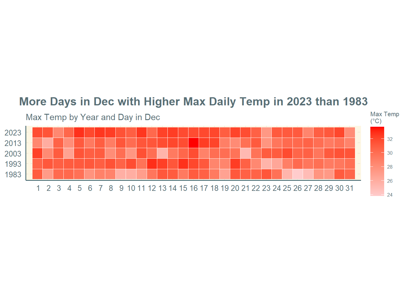
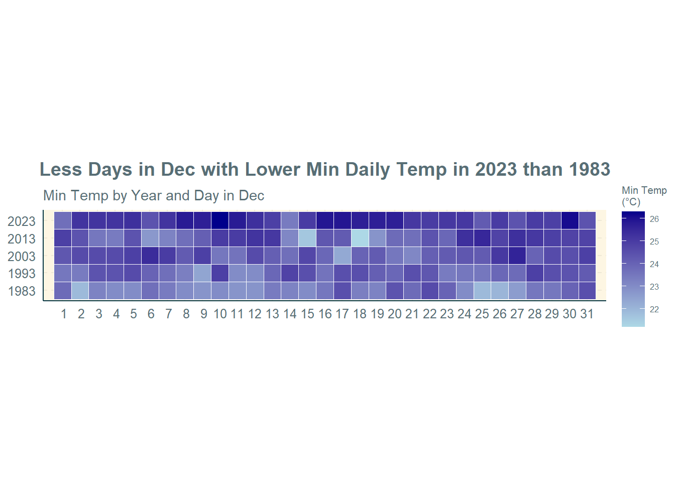
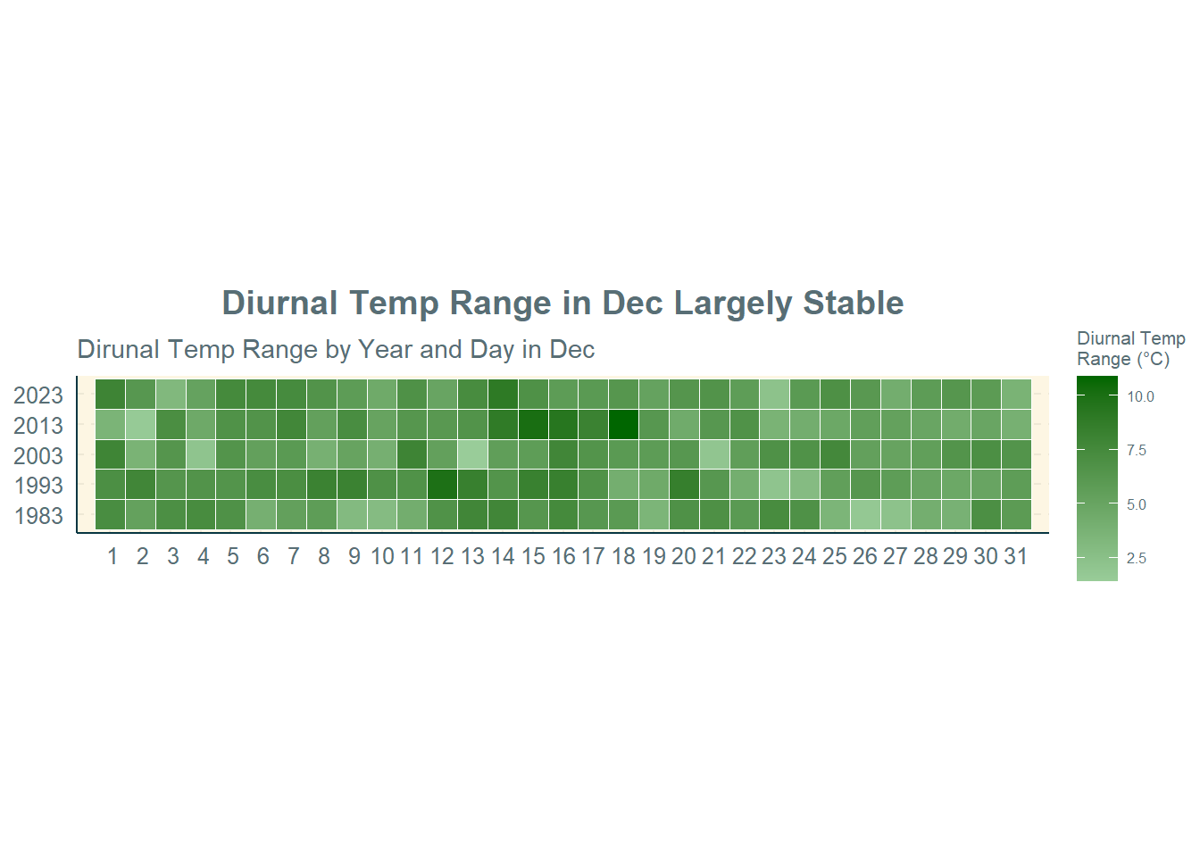
The geom_tile() function in the ggplot2 package is used to plot the calendar heatmaps of the temperature and rainfall variables.
Selection of Technique: The calendar heatmap is used to depict the continuous numerical values (i.e., daily temperatures or rainfall) for multiple groups (i.e., years) in chronological order from Day 1 to Day 31 in December. It provides an interesting way to visualise the variation in values within the month and across the years. They are helpful for visualising temporal trends in a compact and intuitive manner.
Design Principles: An informative title is provided, followed by a factual subtitle. The unit of measurement (i.e., °C or mm) is also indicated. Different colours are used for the heatmaps for different variables.
n = 1:31
#Max Daily Temp
ggplot(weather,
aes(Day,
Year,
fill = Max_Temp)) +
geom_tile(color = "white",
size = 0.1) +
coord_equal() +
scale_fill_gradient(name = "Max Temp\n(°C)",
low = "#FFCCCC",
high = "#FF0000") +
labs(x = NULL,
y = NULL,
title = "More Days in Dec with Higher Max Daily Temp in 2023 than 1983",
subtitle = "Max Temp by Year and Day in Dec") +
theme(axis.ticks = element_blank(),
plot.title = element_text(hjust = 0.5),
legend.title = element_text(size = 8),
legend.text = element_text(size = 6)) +
scale_x_discrete(limits = c(n))
#Min Daily Temp
ggplot(weather,
aes(Day,
Year,
fill = Min_Temp)) +
geom_tile(color = "white",
size = 0.1) +
coord_equal() +
scale_fill_gradient(name = "Min Temp\n(°C)",
low = "light blue",
high = "dark blue") +
labs(x = NULL,
y = NULL,
title = "Less Days in Dec with Lower Min Daily Temp in 2023 than 1983",
subtitle = "Min Temp by Year and Day in Dec") +
theme(axis.ticks = element_blank(),
plot.title = element_text(hjust = 0.5),
legend.title = element_text(size = 8),
legend.text = element_text(size = 6)) +
scale_x_discrete(limits = c(n))
#Diurnal Temp Range
ggplot(weather,
aes(Day,
Year,
fill = Diurnal_Temp_Range)) +
geom_tile(color = "white",
size = 0.1) +
coord_equal() +
scale_fill_gradient(name = "Diurnal Temp\nRange (°C)",
low = "#99CC99",
high = "#006600") +
labs(x = NULL,
y = NULL,
title = "Diurnal Temp Range in Dec Largely Stable",
subtitle = "Dirunal Temp Range by Year and Day in Dec") +
theme(axis.ticks = element_blank(),
plot.title = element_text(hjust = 0.5),
legend.title = element_text(size = 8),
legend.text = element_text(size = 6)) +
scale_x_discrete(limits = c(n))
#Mean Daily Temp
ggplot(weather,
aes(Day,
Year,
fill = Mean_Temp)) +
geom_tile(color = "white",
size = 0.1) +
coord_equal() +
scale_fill_gradient(name = "Mean Temp\n(°C)",
low = "#CC99CC",
high = "#660066") +
labs(x = NULL,
y = NULL,
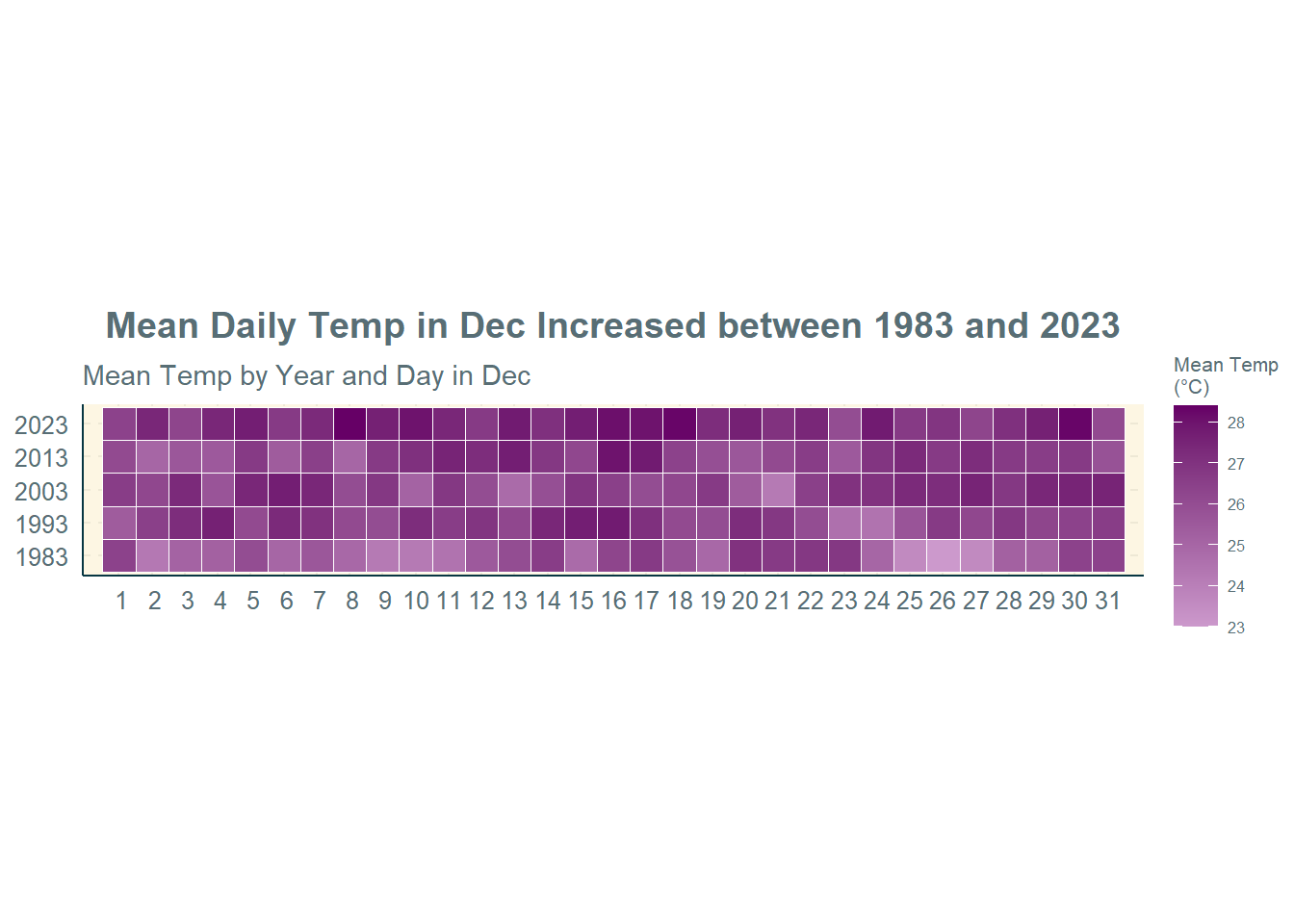
title = "Mean Daily Temp in Dec Increased between 1983 and 2023",
subtitle = "Mean Temp by Year and Day in Dec") +
theme(axis.ticks = element_blank(),
plot.title = element_text(hjust = 0.5),
legend.title = element_text(size = 8),
legend.text = element_text(size = 6)) +
scale_x_discrete(limits = c(n))
#Daily Rainfall
ggplot(weather,
aes(Day,
Year,
fill = Daily_Rainfall)) +
geom_tile(color = "white",
size = 0.1) +
coord_equal() +
scale_fill_gradient(name = "Daily Rainfall\n(mm)",
low = "#CCCCCC",
high = "black") +
labs(x = NULL,
y = NULL,
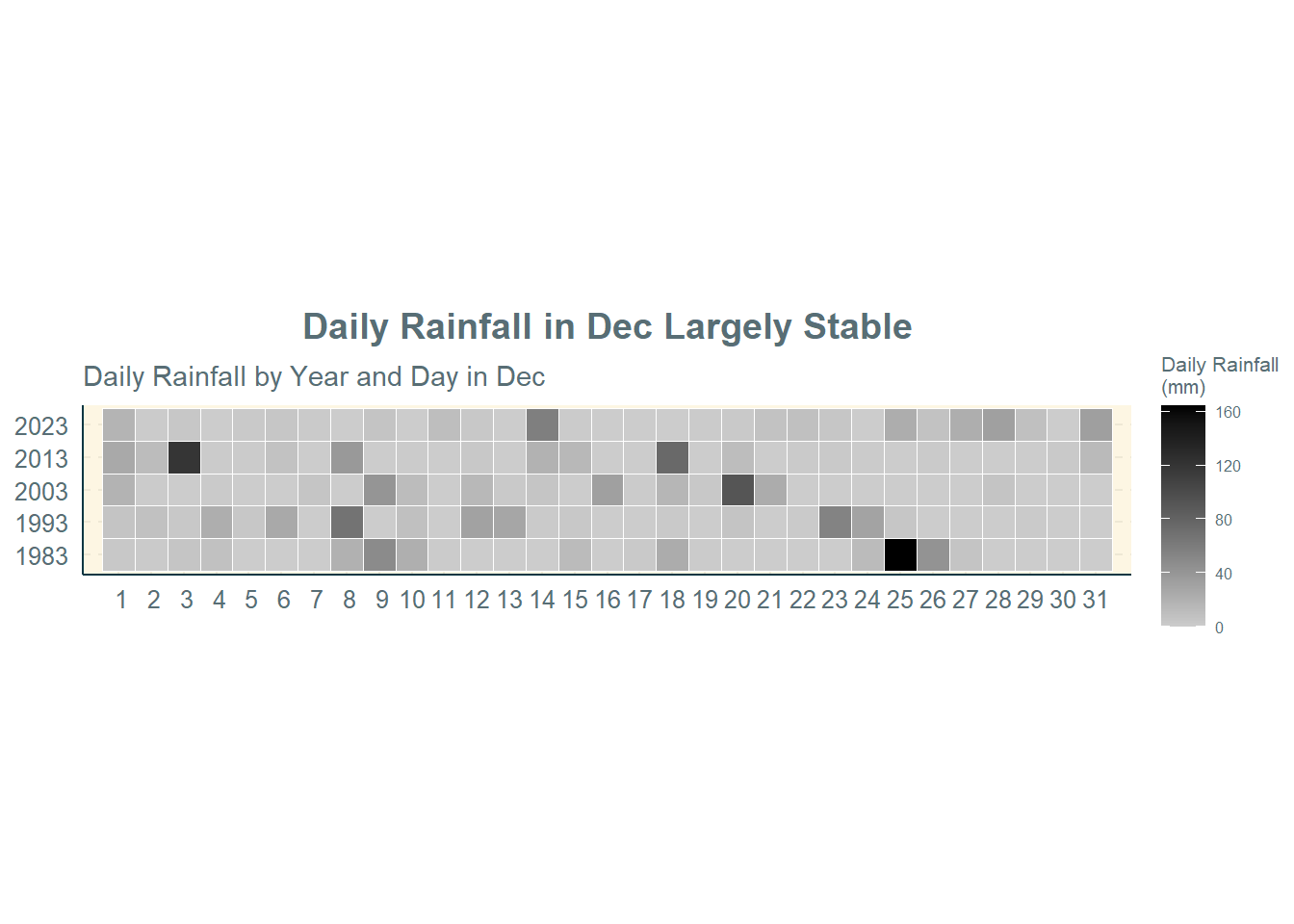
title = "Daily Rainfall in Dec Largely Stable",
subtitle = "Daily Rainfall by Year and Day in Dec") +
theme(axis.ticks = element_blank(),
plot.title = element_text(hjust = 0.5),
legend.title = element_text(size = 8),
legend.text = element_text(size = 6)) +
scale_x_discrete(limits = c(n))Observations:
Maximum Daily Temperature: There are more days in December 2023 with higher maximum daily temperatures than in December 1983. This means that the hot period of a day in December is getting warmer over the years.
Minimum Daily Temperature: There are less days in December 2023 with lower minimum daily temperatures than in December 1983. This means that the cool period of a day in December is getting warmer over the years.
Diurnal Temperature Range: The diurnal temperature range in December has remained largely stable across the years. This is confirmed by the above two points that both the maximum and minimum daily temperatures have been increasing, which means that the range would remain more or less the same.
Mean Daily Temperature: The mean daily temperature in December has increased between 1983 and 2023.
Daily Rainfall: The daily rainfall amounts in December has also remained largely stable across the years.
4.2 Dot Plot of Temperature Variables
The melt() function in the reshape2 package is used to combine the various temperature variables’ values into a single column. The geom_jitter() function in the ggplot2 package is then used to create a dot plot of the temperature variables, with the use of different colour dots to differentiate between the different temperature variables. The geom_jitter() function is used in place of geom_point() to allow the dots to be more spread out and reduce overlaps.
Selection of Technique: The dot plot is used to depict the individual numerical values (i.e., daily temperatures) for multiple groups (i.e., years). It provides an easy way to visualise the variation in values within the month and across the years. They are also helpful for visualising temporal trends.
Design Principles: An informative title is provided. Different colours are used for the dots for different temperature variables. A factual subtitle is included, which also doubles up as a legend for the different dot colours used (thereby removing the need for a legend). The unit of measurement (i.e., °C) is also indicated.
temp = weather %>%
select(1,2,4,5,6) %>%
melt(id = c("Year","Day"))
colnames(temp)[3] = "Temp"
ggplot(temp,
aes(x = Year,
y = value)) +
geom_jitter(aes(color = Temp),
size = 3,
alpha = 0.5,
position = position_jitter(width = 0.2)) +
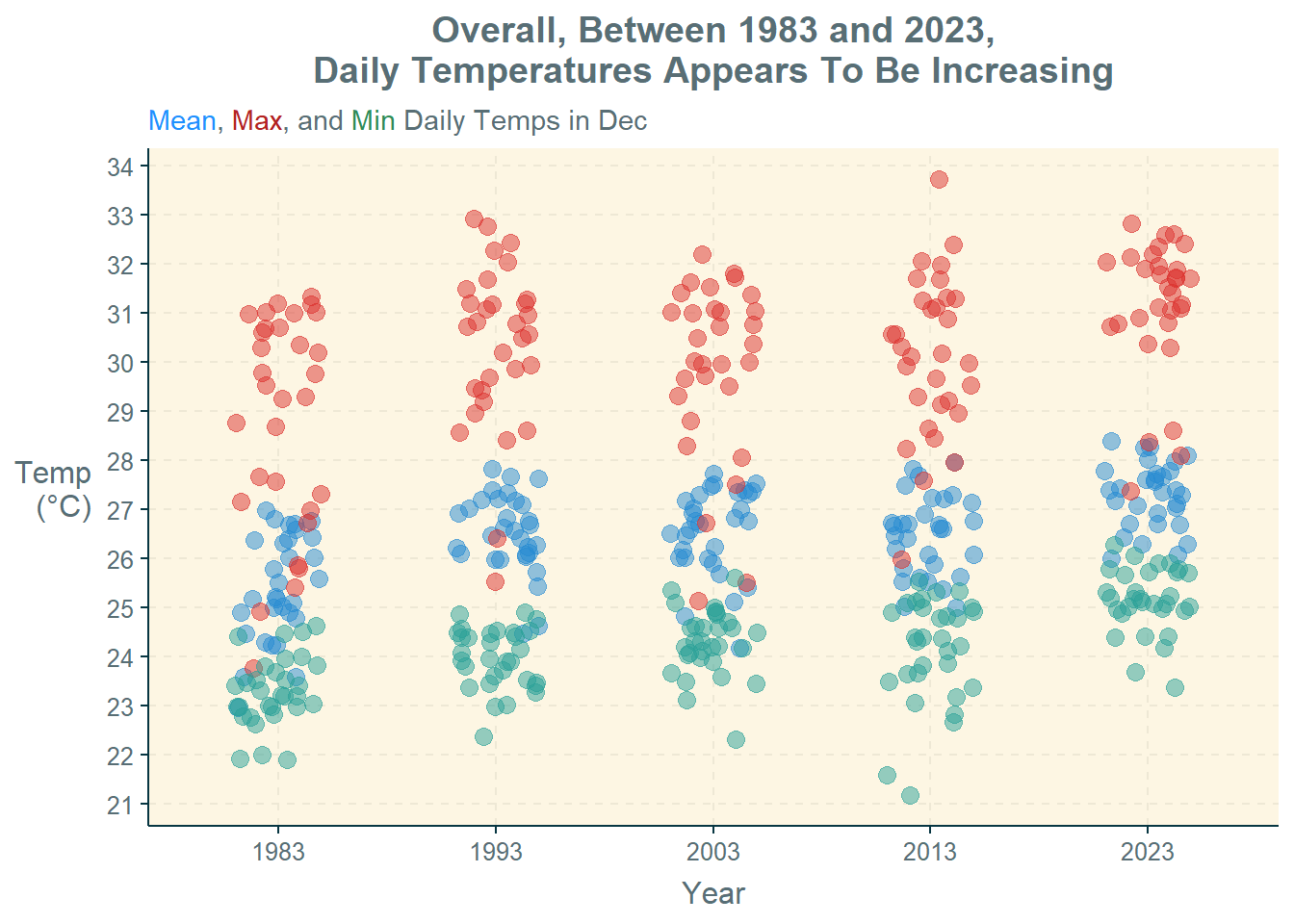
labs(title = "Overall, Between 1983 and 2023,\nDaily Temperatures Appears To Be Increasing",
subtitle = "<span style='color:#1E90FF'>Mean</span>,
<span style='color:#B22222'>Max</span>, and
<span style='color:#2E8B57'>Min</span> Daily Temps in Dec",
x = "Year",
y = "Temp\n(°C)",
colour = "Temp") +
theme(plot.title = element_text(hjust = 0.5),
axis.title.y = element_text(angle=360,
vjust=.5,
hjust=1),
plot.subtitle = element_markdown(),
legend.position = "none" ) +
scale_y_continuous(breaks = seq(20, 35))Observation: Based on the dot plot, it appears that overall, the temperatures (mean, maximum, and minimum) are increasing across the years. The dots also appear to cluster more closely in 2023 than in 1983.
4.3 Bar Graph of Rainfall Variable
The group_by() and summarise() functions in the dplyr package and the sum() function in the base package are used to derive a tibble data frame, rf, containing the total rainfall in December for the different years.
The geom_col() function in the ggplot2 package is then used to plot a bar graph of the total rainfall in December for the different years.
Selection of Technique: The bar graph is used to depict the numerical values (i.e., total rainfall) for multiple groups (i.e., years). It provides an informative way to visualise the total values of a variable across different categories. It is also helpful for comparing the total values and for visualising temporal trends.
Design Principles: An informative title is provided, followed by a factual subtitle. The y-axis title is rotated for easier reading. The unit of measurement (i.e., mm) is also indicated. The exact amounts are also indicated on top of each bar for ease of reference.
rf = weather %>%
group_by(Year) %>%
summarise(Total_Rainfall = sum(Daily_Rainfall))
ggplot(rf,
aes(x = Year,
y = Total_Rainfall)) +
geom_col() +
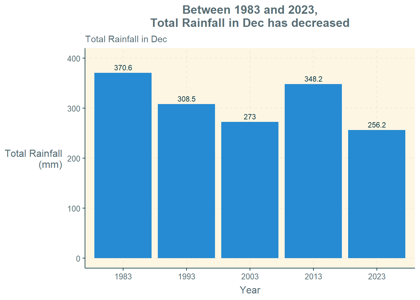
labs(title = "Between 1983 and 2023,\nTotal Rainfall in Dec has decreased",
subtitle = "Total Rainfall in Dec",
x = "Year",
y = "Total Rainfall\n(mm)") +
theme(plot.title = element_text(hjust = 0.5),
axis.title.y = element_text(angle=360,
vjust=.5, hjust=1)) +
geom_text(aes(label = Total_Rainfall), vjust = -0.5) +
coord_cartesian(ylim = c(0, 400))Observation: Between 1983 and 2023, the total rainfall in December has decreased. This was an interesting finding, and reflects the importance of slicing and dicing data from different angles when analysing a single issue, such as rainfall. The aggregate volume of rainfall in December has actually decreased, whereas there is widespread reports regarding increased rainfall intensities (i.e., large amounts of rain in short periods of time). This has implications for both water supply management (less rainfall overall in December) as well as drainage management (high rainfall within a short period).
4.4 Ridgeline Plots of Temperature Variables
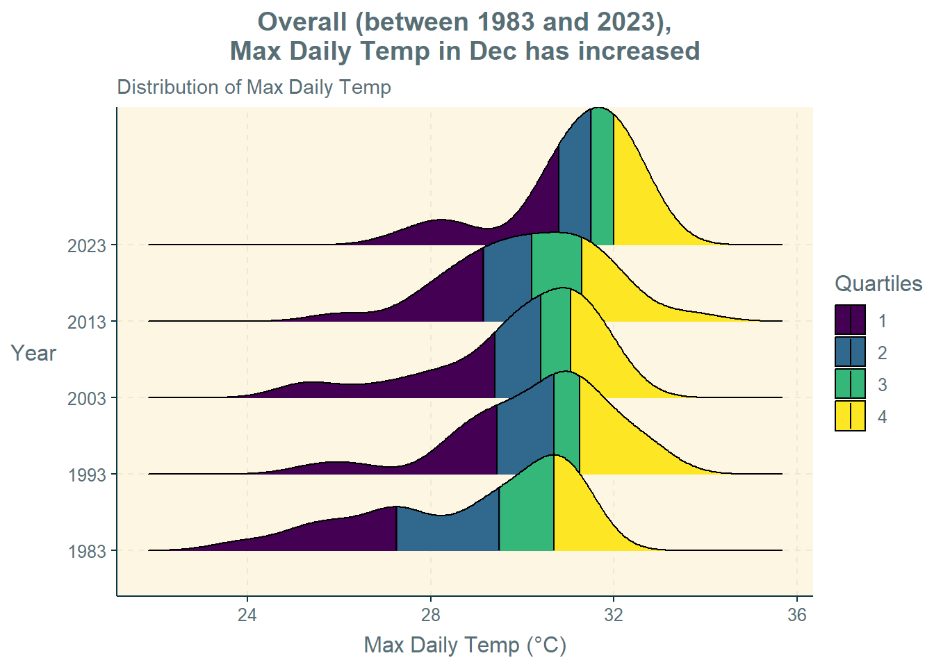
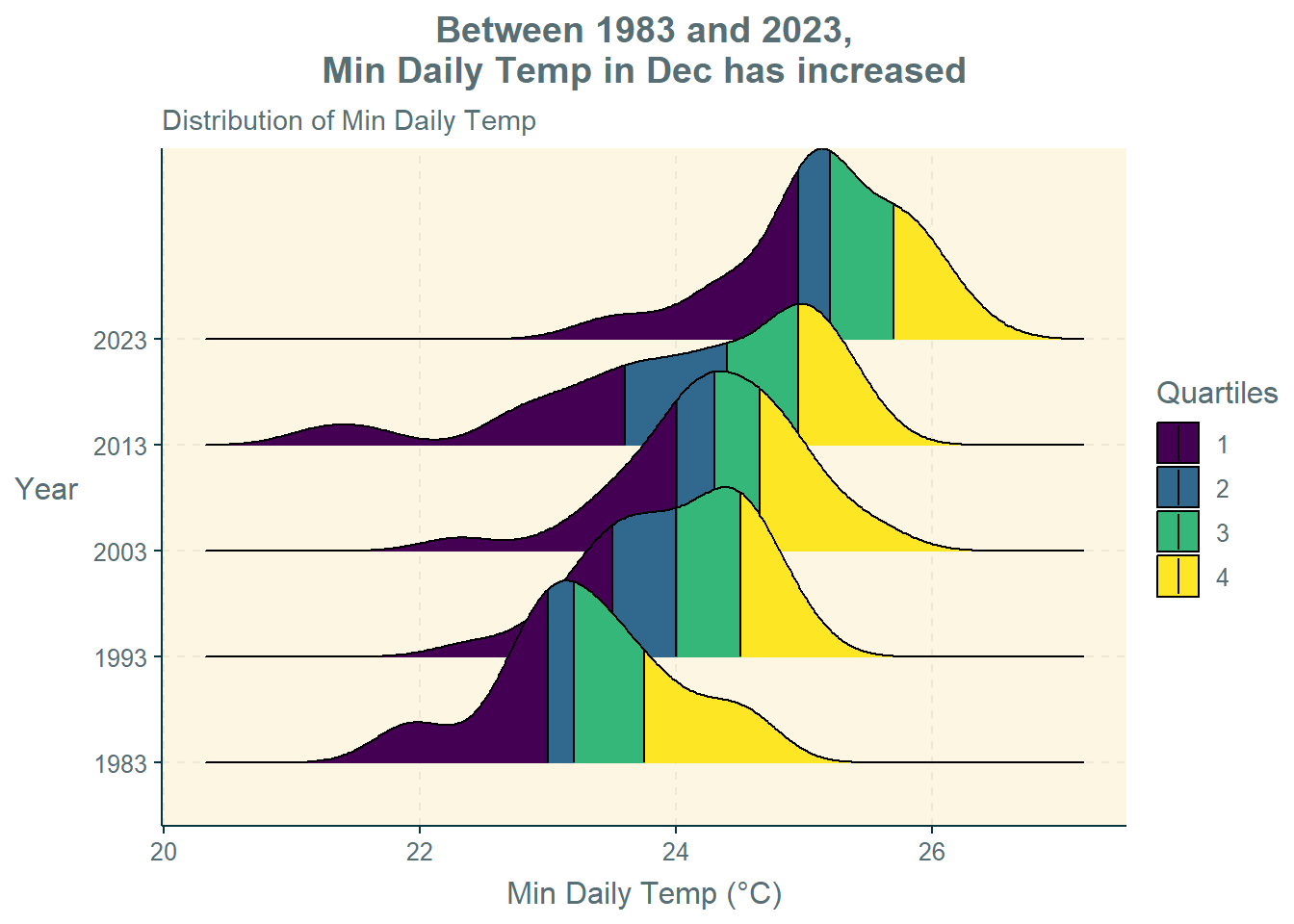
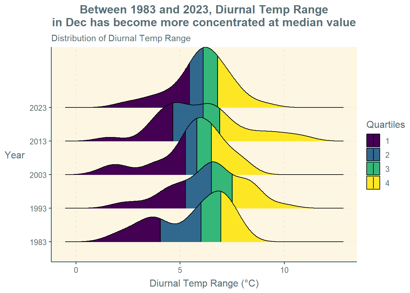
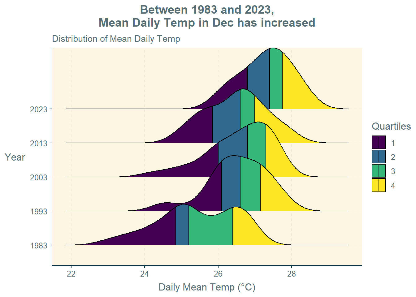
The stat_density_ridges() function in the ggridges package are used to plot the density curves for the four temperature variables (i.e., maximum temperature, minimum temperature, diurnal temperature range, and mean temperature).
Selection of Technique: The ridgeline plots is used to depict the distribution of continuous numerical values (i.e., temperature) for multiple groups (i.e., years). They provide a compact and informative way to visualise the distribution and shape of each group. They are helpful in identifying patterns, trends, or variations between groups.
Design Principles: An informative title is provided, followed by a factual subtitle. The y-axis title is rotated for easier reading. The use of “Quartiles” to colour the plots makes it easy to compare the different values such as median, 25th percentile, and 75th percentile. The unit of measurement (i.e., °C) is also indicated.
#Max Daily Temp
ggplot(weather,
       aes(x = Max_Temp,
           y = Year,
           fill = factor(stat(quantile)))) +
  stat_density_ridges(
    geom = "density_ridges_gradient",
    calc_ecdf = TRUE,
    quantiles = 4,
    quantile_lines = TRUE) +
  scale_fill_viridis_d(name = "Quartiles") +
  labs(title = "Overall (between 1983 and 2023),\nMax Daily Temp in Dec has increased",
       subtitle = "Distribution of Max Daily Temp",
       x = "Max Daily Temp (°C)",
       y = "Year") +
  theme(plot.title = element_text(hjust = 0.5),
        axis.title.y = element_text(angle=360,
                                    vjust=.5,
                                    hjust=1))

#Min Daily Temp
ggplot(weather,
       aes(x = Min_Temp,
           y = Year,
           fill = factor(stat(quantile)))) +
  stat_density_ridges(
    geom = "density_ridges_gradient",
    calc_ecdf = TRUE,
    quantiles = 4,
    quantile_lines = TRUE) +
  scale_fill_viridis_d(name = "Quartiles") +
  labs(title = "Between 1983 and 2023,\nMin Daily Temp in Dec has increased",
       subtitle = "Distribution of Min Daily Temp",
       x = "Min Daily Temp (°C)",
       y = "Year") +
  theme(plot.title = element_text(hjust = 0.5),
        axis.title.y = element_text(angle=360,
                                    vjust=.5,
                                    hjust=1))
#Diurnal Temp Range
ggplot(weather,
       aes(x = Diurnal_Temp_Range,
           y = Year,
           fill = factor(stat(quantile)))) +
  stat_density_ridges(
    geom = "density_ridges_gradient",
    calc_ecdf = TRUE,
    quantiles = 4,
    quantile_lines = TRUE) +
  scale_fill_viridis_d(name = "Quartiles") +
  labs(title = "Between 1983 and 2023, Diurnal Temp Range\nin Dec has become more concentrated at median value",
       subtitle = "Distribution of Diurnal Temp Range",
       x = "Diurnal Temp Range (°C)",
       y = "Year") +
  theme(plot.title = element_text(hjust = 0.5),
        axis.title.y = element_text(angle=360,
                                    vjust=.5,
                                    hjust=1))

#Mean Daily Temp
ggplot(weather,
       aes(x = Mean_Temp,
           y = Year,
           fill = factor(stat(quantile)))) +
  stat_density_ridges(
    geom = "density_ridges_gradient",
    calc_ecdf = TRUE,
    quantiles = 4,
    quantile_lines = TRUE) +
  scale_fill_viridis_d(name = "Quartiles") +
  labs(title = "Between 1983 and 2023,\nMean Daily Temp in Dec has increased",
       subtitle = "Distribution of Mean Daily Temp",
       x = "Mean Daily Temp (°C)",
       y = "Year") +
  theme(plot.title = element_text(hjust = 0.5),
        axis.title.y = element_text(angle=360,
                                    vjust=.5,
hjust=1))Observations:
Maximum Daily Temperature: Overall (between 1983 and 2023), the maximum daily temperature in December has increased. The maximum daily temperature values were more spread out in the past, whereas the spread is now narrower.
Minimum Daily Temperature: Between 1983 and 2023, the minimum daily temperature in December has also increased. In fact, the rise in the median minimum daily temperature is more obvious (i.e., greater) than that for median maximum daily temperature.
Diurnal Temperature Range: Between 1983 and 2023, the median diurnal temperature range in December has not varied very much but has become more concentrated around the median value (i.e., narrower spread).
Mean Daily Temperature: Between 1983 and 2023, the daily mean temperature in December has increased. Again, the daily mean temperature values were more spread out in the past, whereas the spread is now narrower.
5 Confirmatory Data Analysis
Confirmatory data analysis (CDA) is then conducted on the temperature and rainfall variables to confirm the statistical significance of some of the observations obtained in the EDA.
The ggbetweenstats() function in the ggstatsplot package is used to conduct ANOVA tests to see if there are statistical significance for the variables across the different years.
Selection of Technique: The combination of box and violin plots with jittered data points along with the statistical details provides confirmation and visualisation of the ANOVA tests between the values in the different years. The nonparametric test is used because, based on the calendar heatmaps and ridgeline plots, we cannot assume that the values are normally distributed.
Design Principles: An informative title is provided. The y-axis title is rotated for easier reading, and the unit of measurement (i.e., °C) is also indicated.
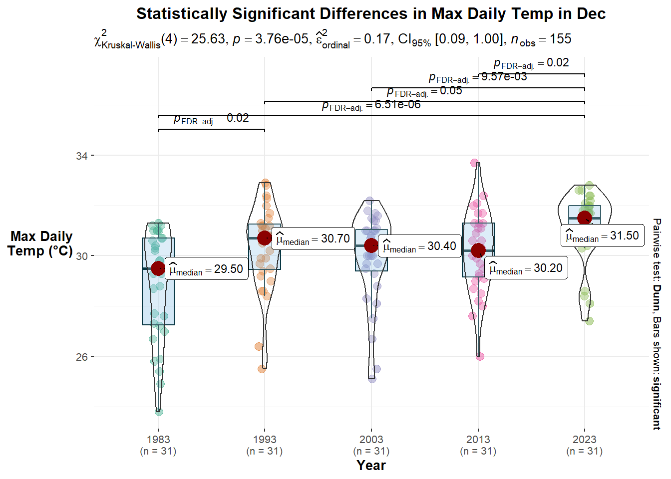
#Max Daily Temp
ggbetweenstats(weather,
x = Year,
y = Max_Temp,
type = "nonparametric",
mean.ci = TRUE,
pairwise.comparisons = TRUE,
pairwise.display = "s",
p.adjust.method = "fdr",
messages = FALSE) +
labs(title = "Statistically Significant Differences in Max Daily Temp in Dec",
x = "Year",
y = "Max Daily\nTemp (°C)") +
theme(plot.title = element_text(hjust = 0.5),
axis.title.y = element_text(angle=360,
vjust=.5,
hjust=1))
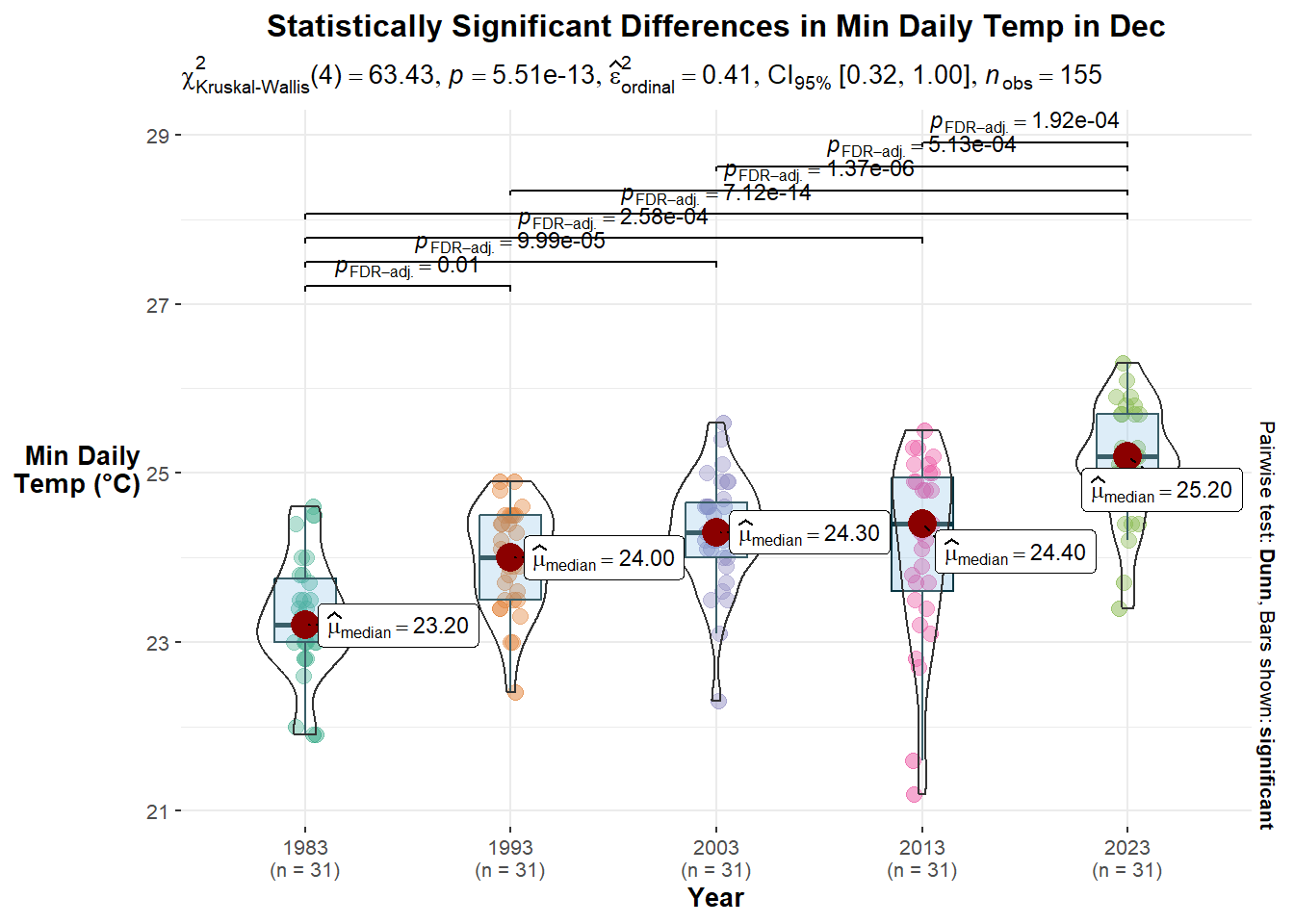
#Min Daily Temp
ggbetweenstats(weather,
x = Year,
y = Min_Temp,
type = "nonparametric",
mean.ci = TRUE,
pairwise.comparisons = TRUE,
pairwise.display = "s",
p.adjust.method = "fdr",
messages = FALSE) +
labs(title = "Statistically Significant Differences in Min Daily Temp in Dec",
x = "Year",
y = "Min Daily\nTemp (°C)") +
theme(plot.title = element_text(hjust = 0.5),
axis.title.y = element_text(angle=360,
vjust=.5,
hjust=1))
#Diurnal Temp Range
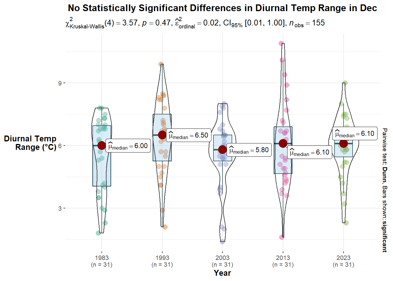
ggbetweenstats(weather,
x = Year,
y = Diurnal_Temp_Range,
type = "nonparametric",
mean.ci = TRUE,
pairwise.comparisons = TRUE,
pairwise.display = "s",
p.adjust.method = "fdr",
messages = FALSE) +
labs(title = "No Statistically Significant Differences in Diurnal Temp Range in Dec",
x = "Year",
y = "Diurnal Temp\nRange (°C)") +
theme(plot.title = element_text(hjust = 0.5),
axis.title.y = element_text(angle=360,
vjust=.5,
hjust=1))
#Mean Daily Temp
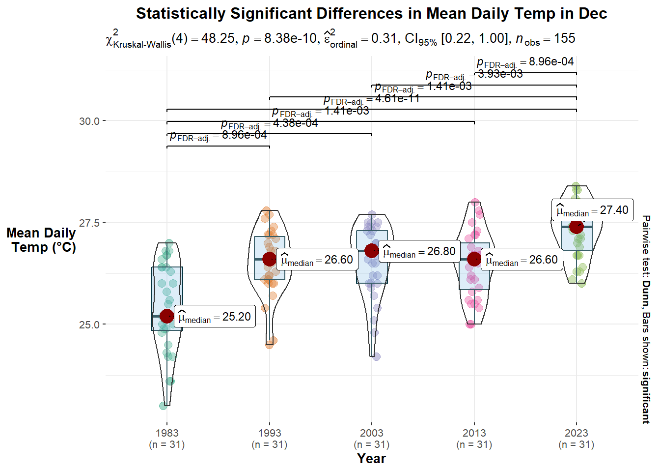
ggbetweenstats(weather,
x = Year,
y = Mean_Temp,
type = "nonparametric",
mean.ci = TRUE,
pairwise.comparisons = TRUE,
pairwise.display = "s",
p.adjust.method = "fdr",
messages = FALSE) +
labs(title = "Statistically Significant Differences in Mean Daily Temp in Dec",
x = "Year",
y = "Mean Daily\nTemp (°C)") +
theme(plot.title = element_text(hjust = 0.5),
axis.title.y = element_text(angle=360,
vjust=.5,
hjust=1))
#Total Rainfall
ggbetweenstats(weather,
x = Year,
y = Max_Temp,
type = "nonparametric",
mean.ci = TRUE,
pairwise.comparisons = TRUE,
pairwise.display = "s",
p.adjust.method = "fdr",
messages = FALSE) +
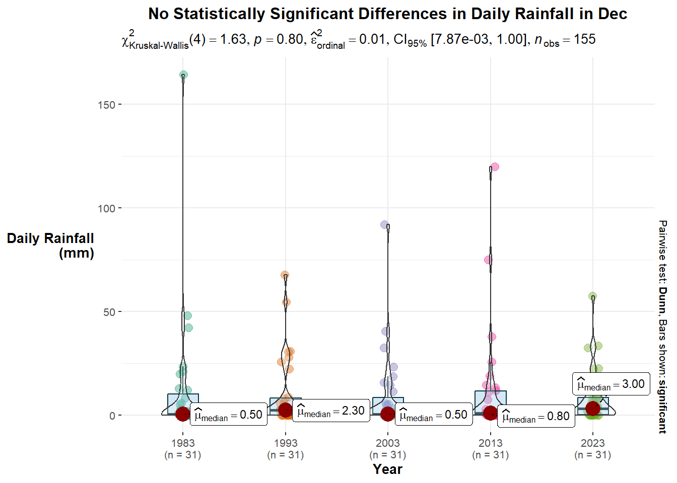
labs(title = "No Statistically Significant Differences in Daily Rainfall in Dec",
x = "Year",
y = "Daily Rainfall\n(mm)") +
theme(plot.title = element_text(hjust = 0.5),
axis.title.y = element_text(angle=360,
vjust=.5,
hjust=1))Observations:
Maximum Daily Temperature: There are statistically significant differences in the maximum daily temperatures in December. Comparing pairwise, there are five pairs of years with statistically significant differences.
Minimum Daily Temperature: There are statistically significant differences in the minimum daily temperatures in December. Comparing pairwise, there are sevenpairs of years with statistically significant differences.
Diurnal Temperature Range: There are no statistically significant differences in the maximum daily temperatures in December.
Mean Daily Temperature: There are statistically significant differences in the mean daily temperatures in December. Comparing pairwise, there are seven pairs of years with statistically significant differences.
Daily Rainfall: There are no statistically significant differences in the daily rainfall amounts in December.
6 Composite Plot
The various plots are then put together in a single analytics-driven data visualisation to tell a story about temperature and rainfall at the Changi weather station in December across the five years. The functions used are ggarrange() and annotate_figure() from the ggpubr package.
The selection of techniques, design principles, and observations for each sub-plot are found at the respective sub-sections in sections 4 and 5 above.
c = ggplot(weather,
       aes(Day,
           Year,
           fill = Diurnal_Temp_Range)) +
  geom_tile(color = "white",
            size = 0.1) +
  coord_equal() +
  scale_fill_gradient(name = "Diurnal Temp\nRange (°C)",
                      low = "#99CC99",
                      high = "#006600") +
  labs(x = NULL,
       y = NULL,
       title = "Diurnal Temp Range in Dec Largely Stable",
       subtitle = "Dirunal Temp Range by Year and Day in Dec") +
  theme(axis.ticks = element_blank(),
        plot.title = element_text(hjust = 0.5, size = 8),
        plot.subtitle = element_text(size = 7),
        axis.text = element_text(size = 5),
        legend.title = element_text(size = 5),
        legend.text = element_text(size = 5)) +
  scale_x_discrete(limits = c(n))

d = ggplot(temp,
       aes(x = Year,
           y = value)) +
  geom_jitter(aes(color = Temp),
              size = 3,
              alpha = 0.5,
              position = position_jitter(width = 0.2)) +
  labs(title = "Overall, Between 1983 and 2023,\nDaily Temperatures Appears To Be Increasing",
       subtitle = "<span style='color:#1E90FF'>Mean</span>,
       <span style='color:#B22222'>Max</span>, and
       <span style='color:#2E8B57'>Min</span> Daily Temps in Dec",
       x = "Year",
       y = "Temp\n(°C)",
       colour = "Temp") +
  theme(plot.title = element_text(hjust = 0.5, size = 8),
        axis.title.y = element_text(angle=360,
                                    vjust=.5,
                                    hjust=1),
        plot.subtitle = element_markdown(size = 7),
        axis.text = element_text(size = 5),
        axis.title = element_text(size = 5),
        legend.position = "none" ) +
  scale_y_continuous(breaks = seq(20, 35))

b = ggplot(rf,
       aes(x = Year,
           y = Total_Rainfall)) +
  geom_col() +
  labs(title = "Between 1983 and 2023,\nTotal Rainfall in Dec has decreased",
          subtitle = "Total Rainfall in Dec",
          x = "Year",
          y = "Total Rainfall\n(mm)") +
  theme(plot.title = element_text(hjust = 0.5, size = 8),
        plot.subtitle = element_text(size = 7),
        axis.title.y = element_text(angle=360,
                                    vjust=.5, hjust=1),
        axis.text = element_text(size = 5),
        axis.title = element_text(size = 5)) +
  geom_text(aes(label = Total_Rainfall), vjust = -0.5, size = 2.5) +
  coord_cartesian(ylim = c(0, 400))


r= ggplot(weather,
       aes(x = Max_Temp,
           y = Year,
           fill = factor(stat(quantile)))) +
  stat_density_ridges(
    geom = "density_ridges_gradient",
    calc_ecdf = TRUE,
    quantiles = 4,
    quantile_lines = TRUE) +
  scale_fill_viridis_d(name = "Quartiles") +
  labs(title = "Overall (between 1983 and 2023),\nMax Daily Temp in Dec has increased",
       subtitle = "Distribution of Max Daily Temp",
       x = "Max Daily Temp (°C)",
       y = "Year") +
  theme(plot.title = element_text(hjust = 0.5, size = 8),
        plot.subtitle = element_text(size = 7),
        axis.title.y = element_text(angle=360,
                                    vjust=.5,
                                    hjust=1),
        axis.text = element_text(size = 5),
        axis.title = element_text(size = 5),
        legend.title = element_text(size = 5),
        legend.text = element_text(size = 5))

plot = ggarrange(d, b, c, r,
          nrow = 2,
          ncol = 2)

annotate_figure(plot,
                top = text_grob('Changes in December Temperatures and Rainfall Across The Years'),
                fig.lab.face = "bold")
7 Interactive Plots
The dot plot and calendar heatmaps are then converted into interactive plots using the ggplotly() function in the ggplotly package. This would allow users to explore the dataset in further detail. In addition, a time-series dot plot is also created to animate the changes in the mean, maximum, and minimum daily temperatures in December across the five years.
#Dot Plot
ggplotly(d)

#Time Series Dot Plot
id = ggplot(temp,
       aes(x = Year,
           y = value)) +
  geom_jitter(aes(color = Temp,
                  frame = Year),
              size = 3,
              alpha = 0.5,
              position = position_jitter(width = 0.2)) +
  labs(title = "Overall, Between 1983 and 2023,\nDaily Temperatures Appears To Be Increasing",
       x = "Year",
       y = "Temp\n(°C)",
       colour = "Temp") +
  theme(plot.title = element_text(hjust = 0.5, size = 8),
        plot.subtitle = element_text(size = 7),
        axis.title.y = element_text(angle=360,
                                    vjust=.5,
                                    hjust=1),
        axis.text = element_text(size = 5),
        axis.title = element_text(size = 5),
        legend.title = element_text(size = 5),
        legend.text = element_text(size = 5))

ggplotly(id)

#Calendar Heatmaps
cal = ggplot(temp,
       aes(Day,
           Year,
           fill = value)) +
  geom_tile(color = "white",
          size = 0.1) +
  coord_equal() +
  scale_fill_gradient(name = "Temp\n(°C)",
                    low = "sky blue",
                    high = "dark blue") +
  facet_wrap(~Temp, ncol = 1) +
  labs(x = NULL, y = NULL,
     title = "Daily Temperatures in Dec") +
  theme(axis.ticks = element_blank(),
        axis.text.x = element_text(size = 7),
        plot.title = element_text(hjust = 0.5),
        legend.title = element_text(size = 8),
        legend.text = element_text(size = 6) )

ggplotly(cal)
8 Conclusion
In conclusion, the ggplot2 package is a powerful package for exploratory data analysis through visualisation. The weather dataset from MSS is interesting and contains useful data for studying Singapore’s weather conditions. The insights gained from analysing the analytical questions posed in this take-home exercise provides a preview of the data analyses that can be conducted in further studies (e.g., expand to include other weather stations across Singapore) to better understand how the various weather conditions have varied across the years. The take-home exercise also highlighted the importance of examining variables from multiple angles (e.g., distribution, variance) and understanding their implications on people (e.g., maximum and minimum temperatures, and diurnal temperature ranges may reveal more about lived experiences as compared to mean temperature).
9 Key References
~~~ End of Take-home Exercise 3 ~~~