devtools::install_github("wilkelab/ungeviz")

pacman::p_load(tidyverse, DT, plotly,
               gganimate, crosstalk, ggdist,
ungeviz)Hands-on Exercise 4C
11 Visualising Uncertainty
11.1 Overview and Learning Outcomes
This hands-on exercise is based on Chapter 11 of the R for Visual Analytics book.
Visualising uncertainty is relatively new in statistical graphics. In this hands-on exercise, the learning outcomes are:
Plot statistics error bars using ggplot2;
Plot interactive error bars by combining ggplot2, plotly and DT packages;
Create advanced uncertainty visualisations using ggdist; and
Create hypothetical outcome plots (HOPs) using the ungeviz package.
11.2 Getting Started
11.2.1 Installing and Loading Required Libraries
In this hands-on exercise, the following R packages are used:
tidyverse (i.e. readr, tidyr, dplyr) for performing data science tasks such as importing, tidying, and wrangling data;
DT for interfacing with JavaScript library DataTables that create interactive tables on html pages;
plotly for plotting interactive statistical graphs;
gganimate (ggplot extension) for creating animated statistical graphs;
crosstalk for inter-widget interactivity for html widgets; and
ggdist for visualising distributions and uncertainty.
The code chunk below uses the p_load() function in the pacman package to check if the packages are installed. If yes, they are then loaded into the R environment. If no, they are installed, then loaded into the R environment.
11.2.2 Importing Data
The dataset for this hands-on exercise is imported into the R environment using the read_csv() function in the readr package and stored as the R object, exam.
exam = read_csv("data/Exam_data.csv")The tibble data frame, exam_data, has 7 columns and 322 rows.
It consists of the year-end examination grades of a cohort of 322 Primary 3 students from a local school.
The 7 variables/attributes are:
Categorical: ID, CLASS, GENDER, and RACE.
Continuous: MATHS, ENGLISH, and SCIENCE.
11.3 Visualising the Uncertainty of Point Estimates: ggplot2 Methods
A point estimate is a single number, e.g., a mean. Uncertainty, on the other hand, is expressed as standard error, confidence interval, or credible interval. Do not confuse the uncertainty of a point estimate with the variation in the sample.
First, the necessary summary statistics, my_sum, regarding Maths scores by race are derived.
my_sum = exam %>%
  group_by(RACE) %>%
  summarise(
    n=n(),
    mean=mean(MATHS),
    sd=sd(MATHS)
    ) %>%
  mutate(se=sd/sqrt(n-1))
Next, the the tibble data frame, my_sum, is displayed in an html table format.
| RACE | n | mean | sd | se |
|---|---|---|---|---|
| Chinese | 193 | 76.50777 | 15.69040 | 1.132357 |
| Indian | 12 | 60.66667 | 23.35237 | 7.041005 |
| Malay | 108 | 57.44444 | 21.13478 | 2.043177 |
| Others | 9 | 69.66667 | 10.72381 | 3.791438 |
knitr::kable(head(my_sum), format = 'html')11.3.1 Plotting Standard Error Bars of Point Estimates
The error bars of mean Maths scores by race are plotted using the geom_errorbar() function in the ggplot2 package.
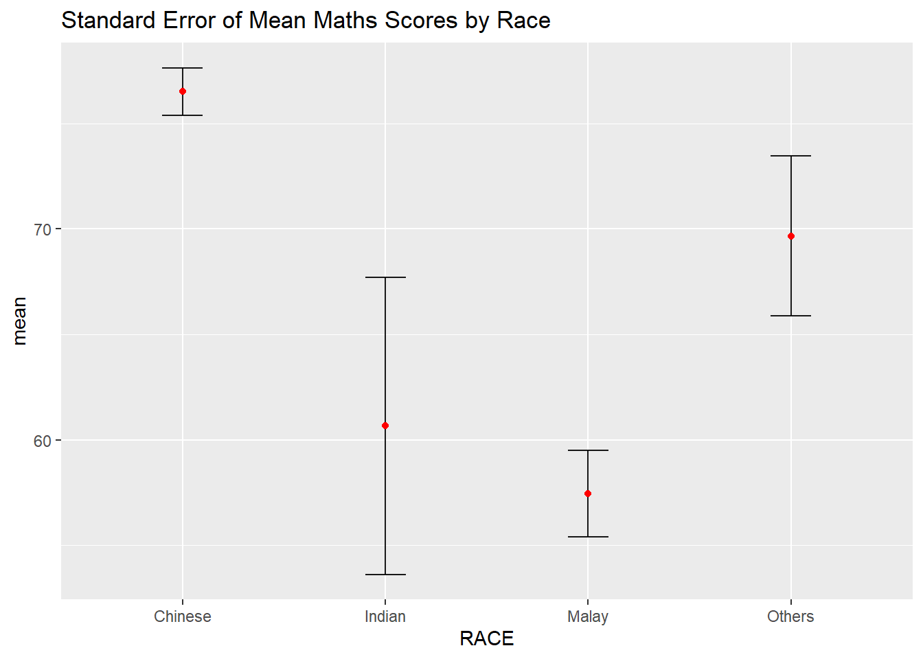
ggplot(my_sum) +
  geom_errorbar(
    aes(x=RACE,
        ymin=mean-se,
        ymax=mean+se),
    width=0.2,
    colour="black",
    alpha=0.9,
    size=0.5) +
  geom_point(aes
           (x=RACE,
            y=mean),
           stat="identity",
           color="red",
           size = 1.5,
           alpha=1) +
  ggtitle("Standard Error of Mean Maths Scores by Race")
11.3.2 Plotting Confidence Interval of Point Estimates
The confidence intervals of mean Maths scores by race are plotted using the geom_errorbar() function in the ggplot2 package.
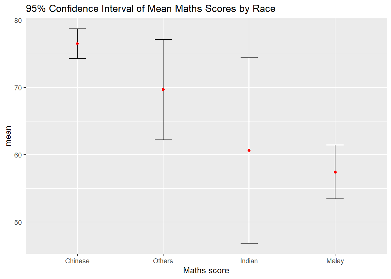
ggplot(my_sum) +
  geom_errorbar(
    aes(x=reorder(RACE, -mean),
        ymin=mean-1.96*se,
        ymax=mean+1.96*se),
    width=0.2,
    colour="black",
    alpha=0.9,
    size=0.5) +
  geom_point(aes
           (x=RACE,
            y=mean),
           stat="identity",
           color="red",
           size = 1.5,
           alpha=1) +
  labs(x = "Maths score",
       title = "95% Confidence Interval of Mean Maths Scores by Race")
11.3.3 Visualising the Uncertainty of Point Estimates with Interactive Error Bars
An interactive plot of error bars for the 99% confidence interval of mean Maths scores by race is plotted using the ggplotly() function in the plotly package, and the datatable() function in the DT package.
shared_df = SharedData$new(my_sum)

bscols(widths = c(4,8),
       ggplotly((ggplot(shared_df) +
                   geom_errorbar(aes(
                     x=reorder(RACE, -mean),
                     ymin=mean-2.58*se,
                     ymax=mean+2.58*se),
                     width=0.2,
                     colour="black",
                     alpha=0.9,
                     size=0.5) +
                   geom_point(aes(
                     x=RACE,
                     y=mean,
                     text = paste("Race:", `RACE`,
                                  "<br>N:", `n`,
                                  "<br>Avg. Scores:", round(mean, digits = 2),
                                  "<br>95% CI:[",
                                  round((mean-2.58*se), digits = 2), ",",
                                  round((mean+2.58*se), digits = 2),"]")),
                     stat="identity",
                     color="red",
                     size = 1.5,
                     alpha=1) +
                   xlab("Race") +
                   ylab("Average Scores") +
                   theme_minimal() +
                   theme(axis.text.x = element_text(
                     angle = 45, vjust = 0.5, hjust=1)) +
                   ggtitle("99% Confidence Interval of Average /<br>Maths scores by Race")),
                tooltip = "text"),
       DT::datatable(shared_df,
                     rownames = FALSE,
                     class="compact",
                     width="100%",
                     options = list(pageLength = 10,
                                    scrollX=T),
                     colnames = c("No. of Pupils",
                                  "Avg Scores",
                                  "Std Dev",
                                  "Std Error")) %>%
         formatRound(columns=c('mean', 'sd', 'se'),
                     digits=2))
11.4 Visualising Uncertainty: ggdist Methods
The ggdist package that provides a flexible set of ggplot2 geoms and stats functions designed for visualising distributions and uncertainty. It is designed for both frequentist and Bayesian uncertainty visualisation, taking the view that uncertainty visualisation can be unified through the perspective of distribution visualisation:
For frequentist models, one visualises confidence distributions or bootstrap distributions; and
For Bayesian models, one visualises probability distributions.
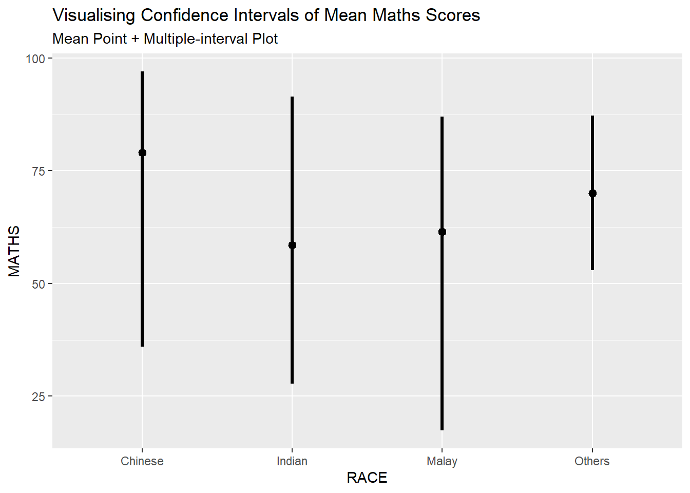
11.4.1 Visualising the Uncertainty of Point Estimates: stat_pointinterval()
The stat_pointinterval() is used to build a plot for displaying distribution of mean Maths scores by race.
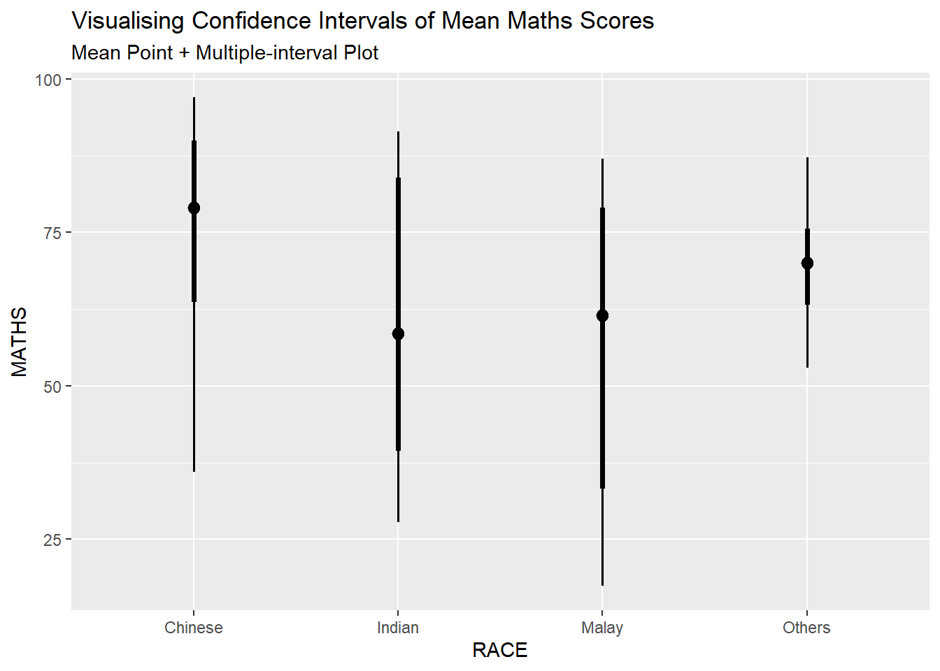
exam %>%
  ggplot(aes(x = RACE,
             y = MATHS)) +
  stat_pointinterval() +
  labs(
    title = "Visualising Confidence Intervals of Mean Maths Scores",
    subtitle = "Mean Point + Multiple-interval Plot")
The plot can be changed if the arguments are adjusted:
“.width” = 0.95;
“.point” = median; and
“.interval” = qi
The plot below is for median Maths scores by race.
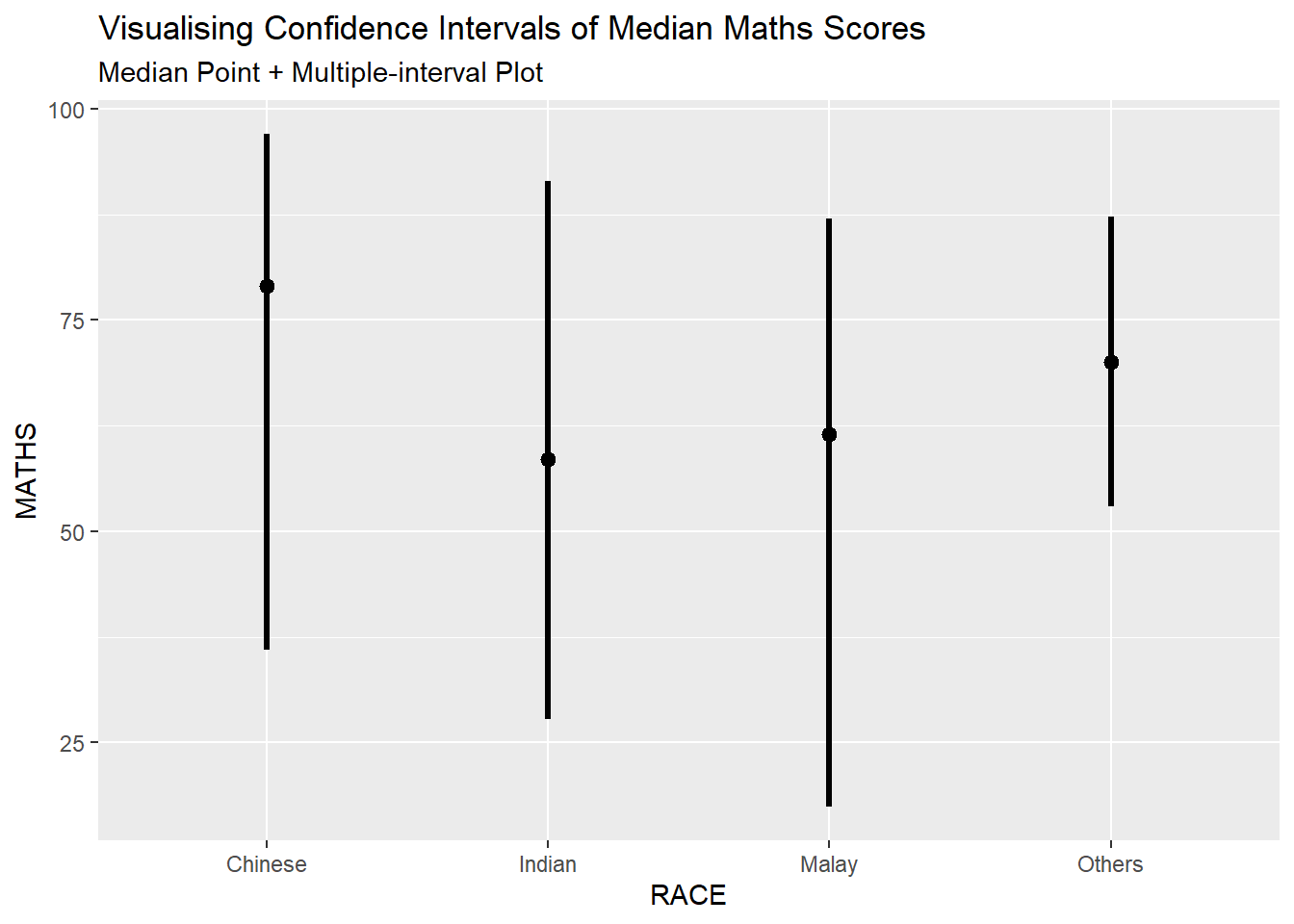
exam %>%
  ggplot(aes(x = RACE, y = MATHS)) +
  stat_pointinterval(.width = 0.95,
  .point = median,
  .interval = qi) +
  labs(
    title = "Visualising Confidence Intervals of Median Maths Scores",
    subtitle = "Median Point + Multiple-interval Plot")
Furthermore, the first plot (mean Maths scores by race) can be adjusted to show 95% and 99% confidence intervals.
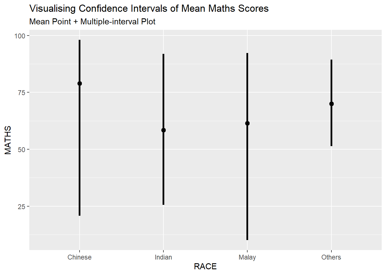
exam %>%
  ggplot(aes(x = RACE,
             y = MATHS)) +
  stat_pointinterval(.width = 0.95) +
  labs(
    title = "Visualising Confidence Intervals of Mean Maths Scores",
    subtitle = "Mean Point + Multiple-interval Plot")

exam %>%
  ggplot(aes(x = RACE,
             y = MATHS)) +
  stat_pointinterval(.width = 0.99) +
  labs(
    title = "Visualising Confidence Intervals of Mean Maths Scores",
    subtitle = "Mean Point + Multiple-interval Plot")
11.4.2 Visualising the Uncertainty of Point Estimates: stat_gradientinterval()
The stat_gradientinterval() is used to build a plot for displaying distribution of Maths scores by race using gradient colours.
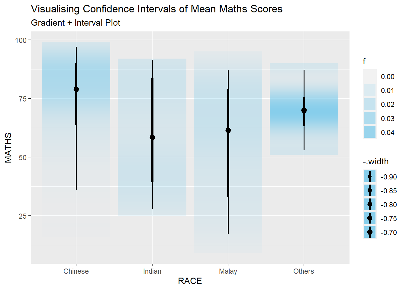
exam %>%
  ggplot(aes(x = RACE,
             y = MATHS)) +
  stat_gradientinterval(
    fill = "skyblue",
    show.legend = TRUE
  ) +
  labs(
    title = "Visualising Confidence Intervals of Mean Maths Scores",
    subtitle = "Gradient + Interval Plot")
11.5 Visualising Uncertainty with Hypothetical Outcome Plots (HOPs)
An animated plot the the hypothetical outcome plots is created below.
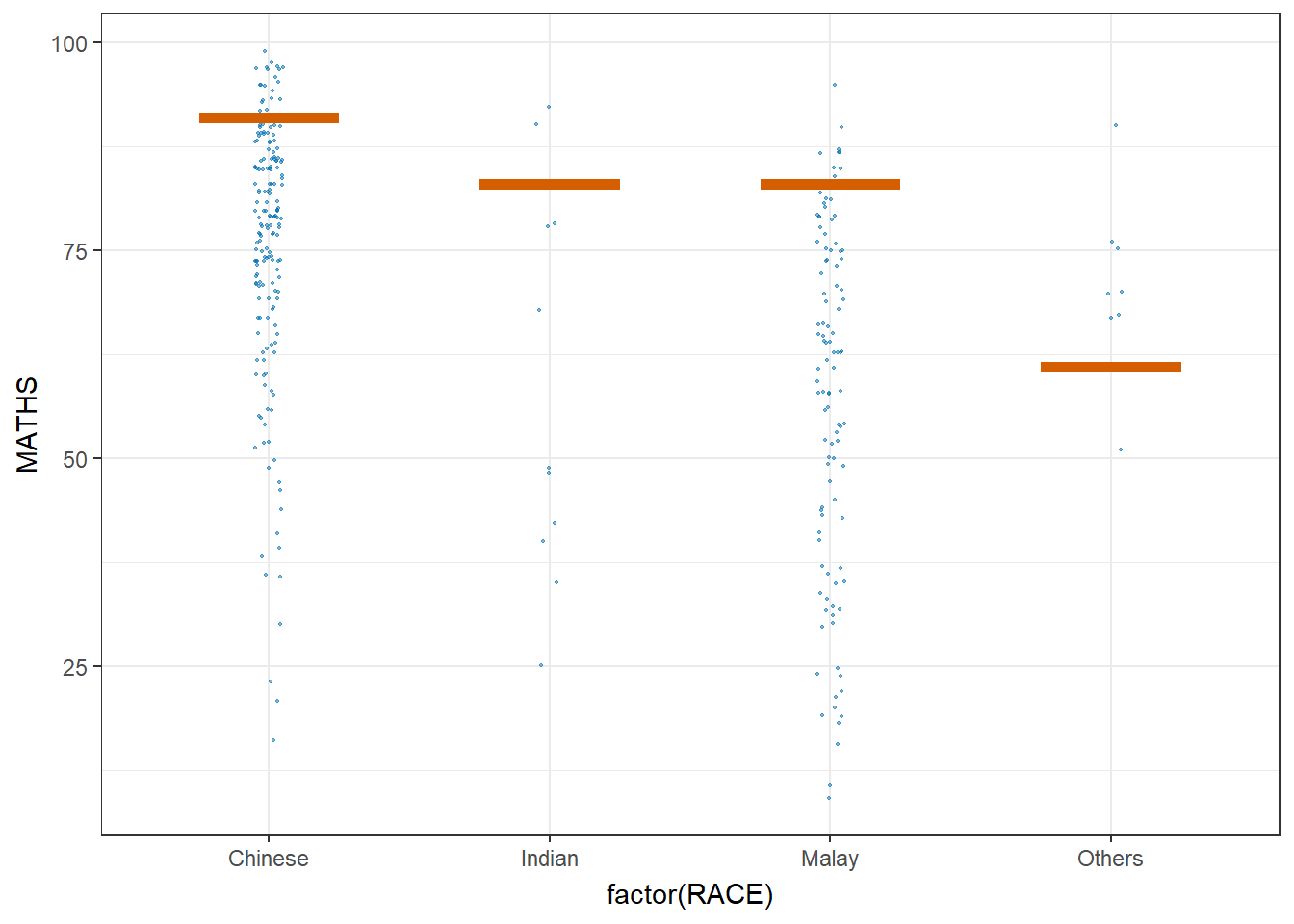
ggplot(data = exam,
       (aes(x = factor(RACE), y = MATHS))) +
  geom_point(position = position_jitter(
    height = 0.3, width = 0.05),
    size = 0.4, color = "#0072B2", alpha = 1/2) +
  geom_hpline(data = sampler(25, group = RACE), height = 0.6, color = "#D55E00") +
  theme_bw() +
  # `.draw` is a generated column indicating the sample draw
  transition_states(.draw, 1, 3)
~~~ End of Hands-on Exercise 4C ~~~