pacman::p_load(ggHoriPlot, ggthemes, tidyverse)In-class Exercise 6
20 Time on the Horizon: ggHoriPlot Methods
20.1 Overview and Learning Outcomes
This hands-on exercise is based on Chapter 20 of the R for Visual Analytics book.
A horizon graph is an analytical graphical method specially designed for visualising large numbers of time-series. It aims to overcome the issue of visualising highly overlapping time-series.
A horizon graph essentially an area chart that has been split into slices and the slices then layered on top of one another with the areas representing the highest (absolute) values on top. Each slice has a greater intensity of colour based on the absolute value it represents.
The learning outcome is to plot a horizon graph using the ggHoriPlot package.
20.2 Getting Started
20.2.1 Installing and Loading Required Libraries
In this hands-on exercise, the following R packages are used:
- tidyverse (i.e. readr, tidyr, dplyr) for performing data science tasks such as importing, tidying, and wrangling data;
- ggthemes for extra themes, geoms, and scales for ggplot2; and
- ggHoriPlot for plotting horizon plots for ggplot2.
20.2.2 Importing Data
In this in-class exercise, the Average Retail Prices Of Selected Consumer Items dataset will be used. The csv file, AVERP, is imported into the R environment using the read_csv() function in the readr package.
Note: By default, the read_csv() function will import data in the “Date” field as a character data type. The
dmy()function in the lubridate package is used to change the “Date” field into the appropriate date data type.
averp = read_csv("data/AVERP.csv") %>%
  mutate(`Date` = dmy(`Date`))
20.3 Plotting Horizon Graph
The horizon graph is then plotted below.
averp %>%
  # from 2018 onwards
  filter(Date >= "2018-01-01") %>%
  ggplot() +
  geom_horizon(aes(x = Date, y=Values),
               origin = "midpoint",
               horizonscale = 6)+
  # to create one row for one item
  facet_grid(`Consumer Items`~.) +
  # theme that use minimal no. of fields posible
    theme_few() +
  # diverging colours used to get good separation of values above and below reference point
  scale_fill_hcl(palette = 'RdBu') +
  theme(panel.spacing.y=unit(0, "lines"), strip.text.y = element_text(
    size = 5, angle = 0, hjust = 0),
    legend.position = 'none',
    axis.text.y = element_blank(),
    axis.text.x = element_text(size=7),
    axis.title.y = element_blank(),
    axis.title.x = element_blank(),
    axis.ticks.y = element_blank(),
    panel.border = element_blank()
    ) +
    scale_x_date(expand=c(0,0), date_breaks = "3 month", date_labels = "%b%y") +
  ggtitle('Average Retail Prices of Selected Consumer Items (Jan 2018 to Dec 2022)')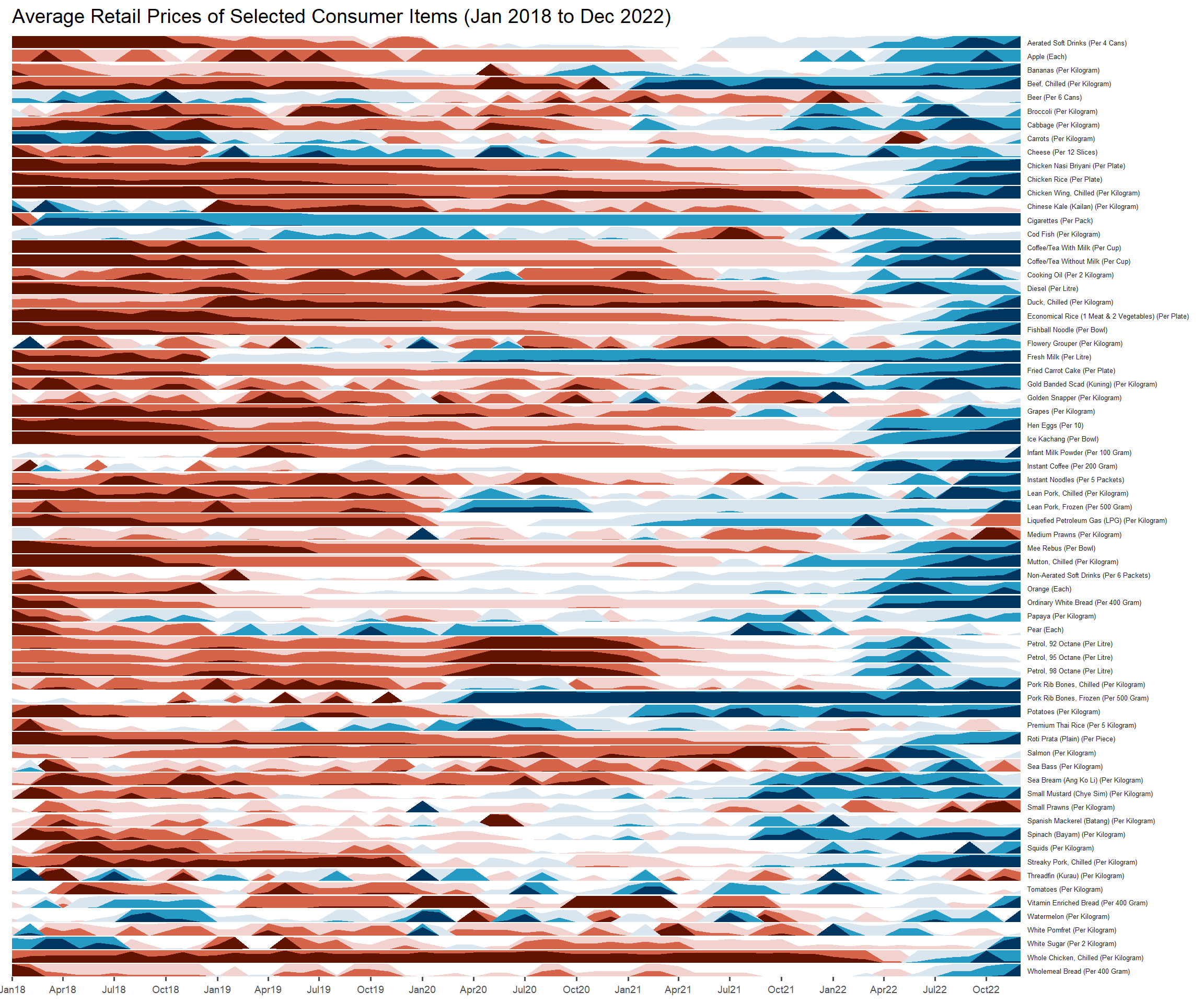
~~~ End of In-class Exercise 6 ~~~