pacman::p_load(tidyverse, FunnelPlotR,
knitr, plotly)Hands-on Exercise 4D
12 Funnel Plots for Fair Comparisons
12.1 Overview and Learning Outcomes
This hands-on exercise is based on Chapter 12 of the R for Visual Analytics book.
A funnel plot is a specially designed data visualisation for conducting unbiased comparison between outlets, stores or business entities. In this hands-on exercise, the learning outcomes are:
Plot a funnel plot using the funnelPlotR package;
Plot a static funnel plot using the ggplot2 package; and
Plot an interactive funnel plot using both plotly R and ggplot2 packages.
12.2 Getting Started
12.2.1 Installing and Loading Required Libraries
In this hands-on exercise, the following R packages are used:
tidyverse (i.e. readr, tidyr, dplyr) for performing data science tasks such as importing, tidying, and wrangling data;
FunnelPlotR for creating funnel plot;
knitr for building static html table; and
plotly for plotting interactive statistical graphs.
The code chunk below uses the p_load() function in the pacman package to check if the packages are installed. If yes, they are then loaded into the R environment. If no, they are installed, then loaded into the R environment.
12.2.2 Importing Data
The dataset for this hands-on exercise is imported into the R environment using the read_csv() function in the readr package and stored as the R object, covid19.
covid19 = read_csv("data/COVID-19_DKI_Jakarta.csv") %>%
  mutate_if(is.character, as.factor)
The tibble data frame, covid19, has 7 columns and 267 rows.
head(covid19)# A tibble: 6 × 7
`Sub-district ID` City District `Sub-district` Positive Recovered Death
<dbl> <fct> <fct> <fct> <dbl> <dbl> <dbl>
1 3172051003 JAKARTA UT… PADEMAN… ANCOL 1776 1691 26
2 3173041007 JAKARTA BA… TAMBORA ANGKE 1783 1720 29
3 3175041005 JAKARTA TI… KRAMAT … BALE KAMBANG 2049 1964 31
4 3175031003 JAKARTA TI… JATINEG… BALI MESTER 827 797 13
5 3175101006 JAKARTA TI… CIPAYUNG BAMBU APUS 2866 2792 27
6 3174031002 JAKARTA SE… MAMPANG… BANGKA 1828 1757 2612.3 FunnelPlotR Methods
The FunnelPlotR package uses ggplot to generate funnel plots. It requires a “numerator” (events of interest), “denominator” (population to be considered) and “group”.
The key arguments selected for customisation are:
“limit” to set plot limits (95 or 99);
“label_outliers” to label outliers (true or false);
“Poisson_limits” to add Poisson limits to the plot;
“OD_adjust” to add overdispersed limits to the plot;
“xrange” and “yrange” to specify the range to display for axes, acts like a zoom function; and
Other aesthetic components such as graph title, axis labels, etc.
12.3.1 FunnelPlotR Methods: The Basic Plot
The funnel_plot function is used to create the basic plot, with the following arguments:
The “group” argument is different from that in the scatterplot. Here, it defines the level of the points to be plotted i.e. Sub-district, District or City. If City is chosen, there are only six data points.
By default, “data_type” argument is “SR”.
The “limit” argument states the plot limits. The accepted values are: 95 or 99, corresponding to 95% or 99.8% quantiles of the distribution.
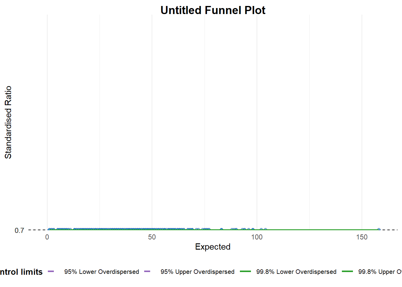
A funnel plot object with 267 points of which 0 are outliers.
Plot is adjusted for overdispersion. funnel_plot(
numerator = covid19$Positive,
denominator = covid19$Death,
group = covid19$`Sub-district`)A funnel plot object with 267 points of which 0 are outliers. Plot is adjusted for overdispersion.
12.3.2 FunnelPlotR Methods: Makeover 1
The funnel plot is improved by changing the “data_type” argument to “PR” (i.e., proportions), and stating the “xrange” and “yrange” arguments to set the range of the axes.
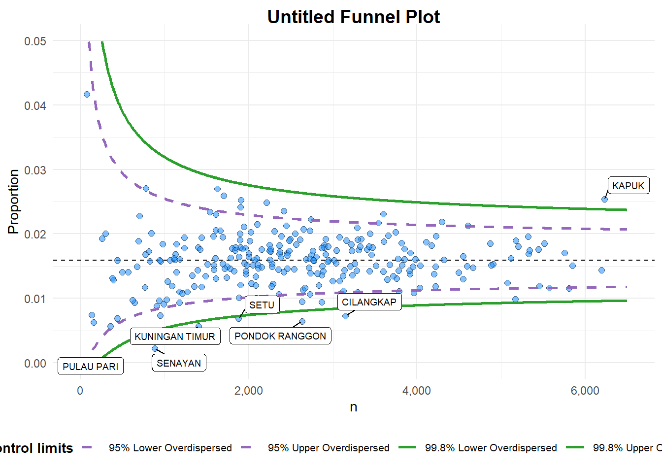
A funnel plot object with 267 points of which 7 are outliers.
Plot is adjusted for overdispersion. funnel_plot(
numerator = covid19$Death,
denominator = covid19$Positive,
group = covid19$`Sub-district`,
data_type = "PR", #<<
xrange = c(0, 6500), #<<
yrange = c(0, 0.05) #<<
)A funnel plot object with 267 points of which 7 are outliers. Plot is adjusted for overdispersion.
12.3.3 FunnelPlotR Methods: Makeover 2
The funnel plot is further improved by adding the “label” argument and setting it as “NA” to remove the default label outliers feature, as well as including the “title”, “x_label”, and “y_label” arguments to add a plot title and axes titles.
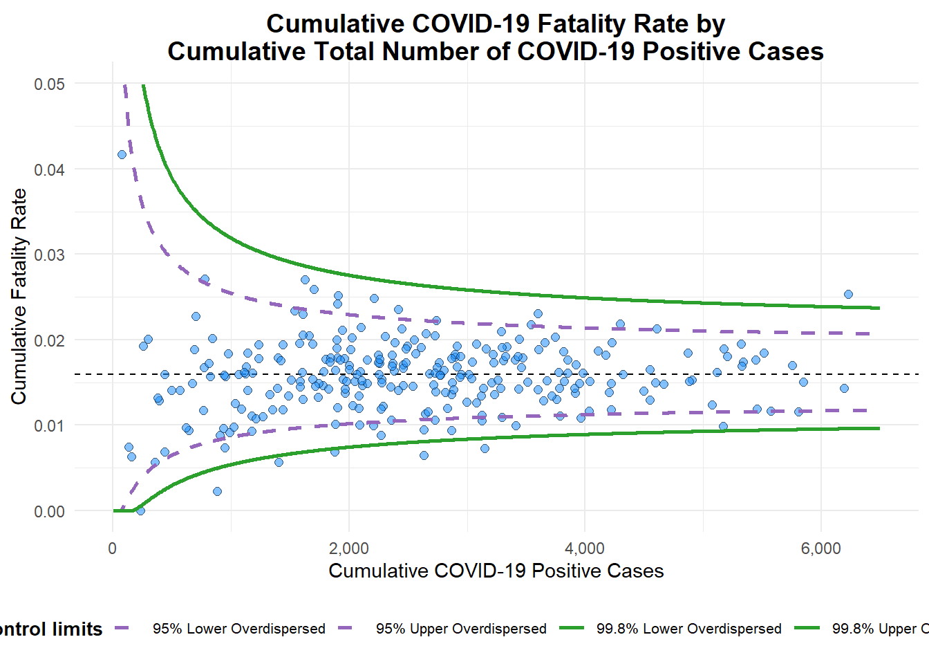
A funnel plot object with 267 points of which 7 are outliers.
Plot is adjusted for overdispersion. funnel_plot(
numerator = covid19$Death,
denominator = covid19$Positive,
group = covid19$`Sub-district`,
data_type = "PR",
xrange = c(0, 6500),
yrange = c(0, 0.05),
label = NA,
title = "Cumulative COVID-19 Fatality Rate by\nCumulative Total Number of COVID-19 Positive Cases", #<<
x_label = "Cumulative COVID-19 Positive Cases", #<<
y_label = "Cumulative Fatality Rate" #<<
)A funnel plot object with 267 points of which 7 are outliers. Plot is adjusted for overdispersion.
12.4 Funnel Plot for Fair Visual Comparison: ggplot2 Methods
A funnel plot can also be created using ggplot2.
12.4.1 Computing the Basic Derived Fields
First, the cumulative death rate and standard error of the cumulative death rate is derived.
df = covid19 %>%
  mutate(rate = Death / Positive) %>%
  mutate(rate.se = sqrt((rate*(1-rate)) / (Positive))) %>%
  filter(rate > 0)
Next, the fit.mean is computed using the weighted.mean() function in the stats package.
fit.mean = weighted.mean(df$rate, 1/df$rate.se^2)12.4.2 Calculating Lower and Upper Limits for 95% and 99.9% Confidence Interval
Then, the lower and upper limits for a 95% confidence interval is computed using the fit.mean.
number.seq = seq(1, max(df$Positive), 1)
number.ll95 = fit.mean - 1.96 * sqrt((fit.mean*(1-fit.mean)) / (number.seq))
number.ul95 = fit.mean + 1.96 * sqrt((fit.mean*(1-fit.mean)) / (number.seq))
number.ll999 = fit.mean - 3.29 * sqrt((fit.mean*(1-fit.mean)) / (number.seq))
number.ul999 = fit.mean + 3.29 * sqrt((fit.mean*(1-fit.mean)) / (number.seq))
dfCI <- data.frame(number.ll95, number.ul95, number.ll999,
                   number.ul999, number.seq, fit.mean)
12.4.3 Plotting A Static Funnel Plot
A static funnel plot is created using ggplot2 functions.
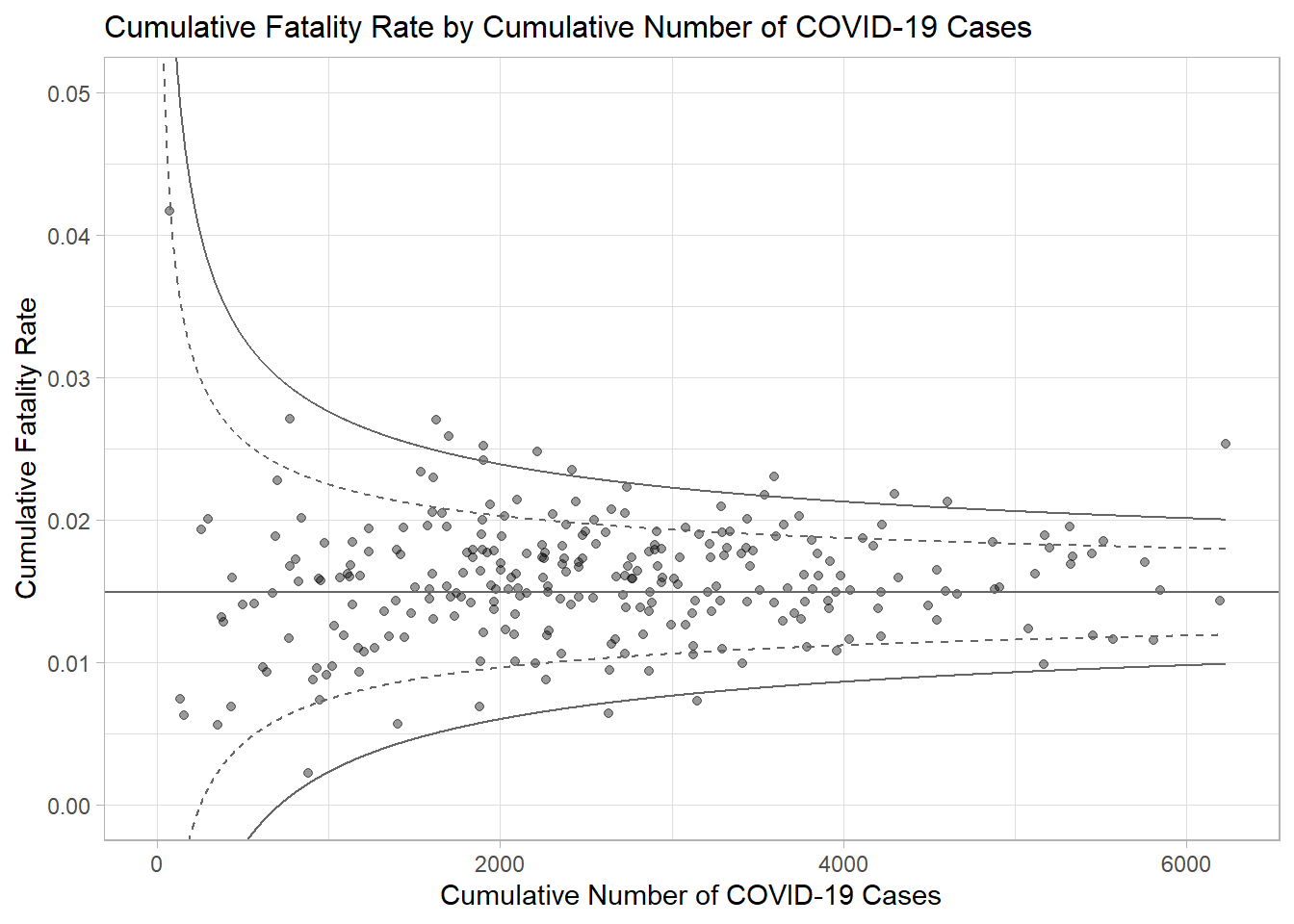
p = ggplot(df, aes(x = Positive, y = rate)) +
  geom_point(aes(label=`Sub-district`),
             alpha=0.4) +
  geom_line(data = dfCI,
            aes(x = number.seq,
                y = number.ll95),
            size = 0.4,
            colour = "grey40",
            linetype = "dashed") +
  geom_line(data = dfCI,
            aes(x = number.seq,
                y = number.ul95),
            size = 0.4,
            colour = "grey40",
            linetype = "dashed") +
  geom_line(data = dfCI,
            aes(x = number.seq,
                y = number.ll999),
            size = 0.4,
            colour = "grey40") +
  geom_line(data = dfCI,
            aes(x = number.seq,
                y = number.ul999),
            size = 0.4,
            colour = "grey40") +
  geom_hline(data = dfCI,
             aes(yintercept = fit.mean),
             size = 0.4,
             colour = "grey40") +
  coord_cartesian(ylim=c(0,0.05)) +
  annotate("text", x = 1, y = -0.13, label = "95%", size = 3, colour = "grey40") +
  annotate("text", x = 4.5, y = -0.18, label = "99%", size = 3, colour = "grey40") +
  ggtitle("Cumulative Fatality Rate by Cumulative Number of COVID-19 Cases") +
  xlab("Cumulative Number of COVID-19 Cases") +
  ylab("Cumulative Fatality Rate") +
  theme_light() +
  theme(plot.title = element_text(size=12),
        legend.position = c(0.91,0.85),
        legend.title = element_text(size=7),
        legend.text = element_text(size=7),
        legend.background = element_rect(colour = "grey60", linetype = "dotted"),
        legend.key.height = unit(0.3, "cm"))
p
12.4.4 Interactive Funnel Plot: plotly + ggplot2
Interactivity is then added to the funnel plot using the ggplotly() function in the plotly package.
fp_ggplotly = ggplotly(p,
  tooltip = c("label",
              "x",
              "y"))
fp_ggplotly
12.5 References
funnelPlotR package.
ggplot2 package.
~~~ End of Hands-on Exercise 4D ~~~